

Every setting in the Elite theme,
explained.
A detailed reference for every global setting and every section you can add to your store’s pages — what it does, where to find it, and how each option behaves.
- 46
- items documented
- 9
- global settings
- 37
- page sections
Showing 46 of 46
Global settings
Settings that apply to the whole store: header, footer, colors, buttons, and the product and category pages.
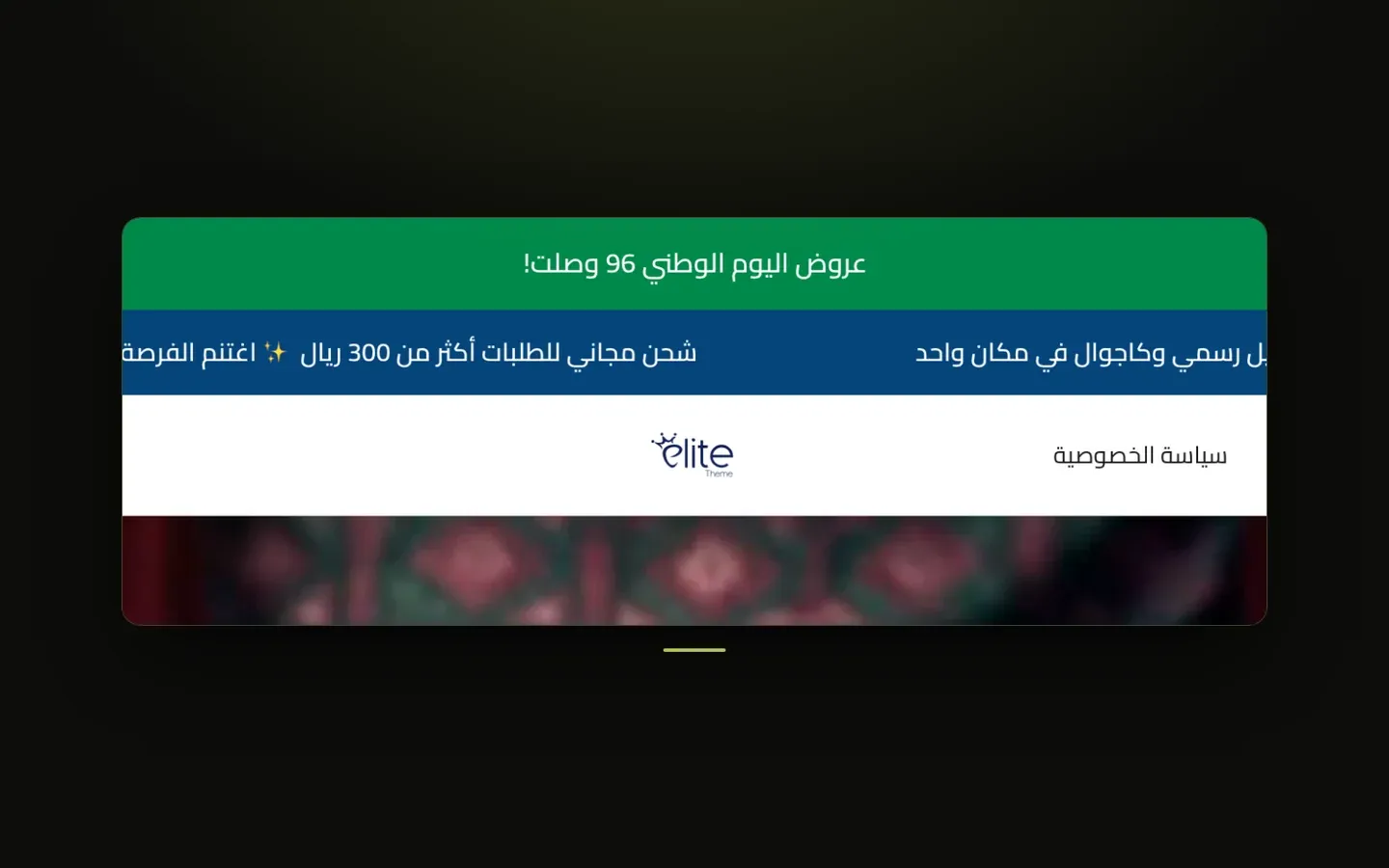
Header
These settings control everything at the top of your store: the optional mini top bar and announcement bars, the main header with its logo, menu links and icons, plus the parts connected to it such as the mobile side menu, the mobile bottom bar, the category row, the search window and the cart drawer. You'll find them in the theme customizer under Header, where each group below has its own tab (for example Header → Announcement Bar).
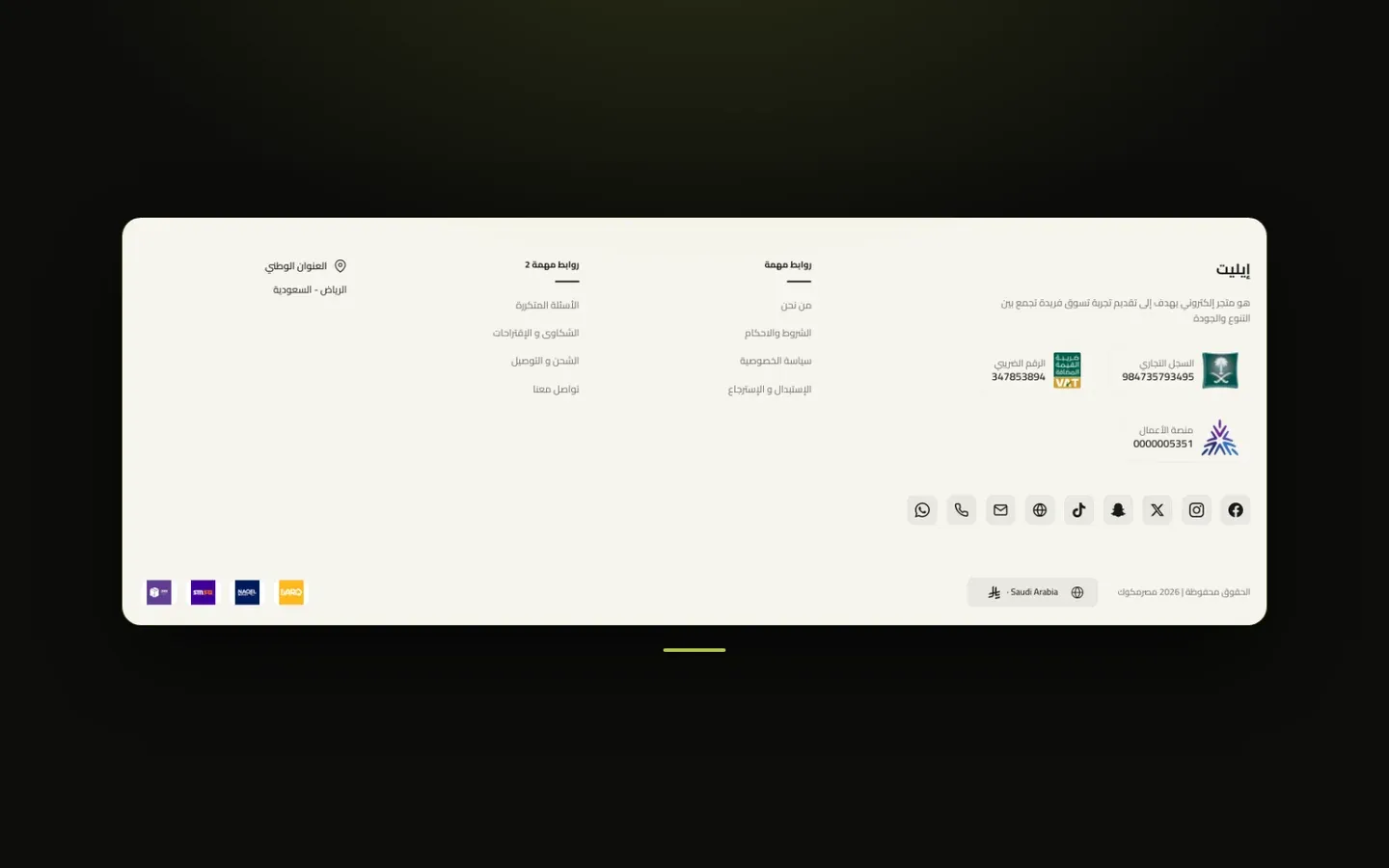
Footer
The footer is the area at the very bottom of every page of your store, where your logo, a short description, link columns, app download badges, contact and certificate details, copyright, and payment and shipping icons appear. You'll find these settings in the theme customizer under Footer, and the last group on this page is under Layout → Internal Pages Footer Style.
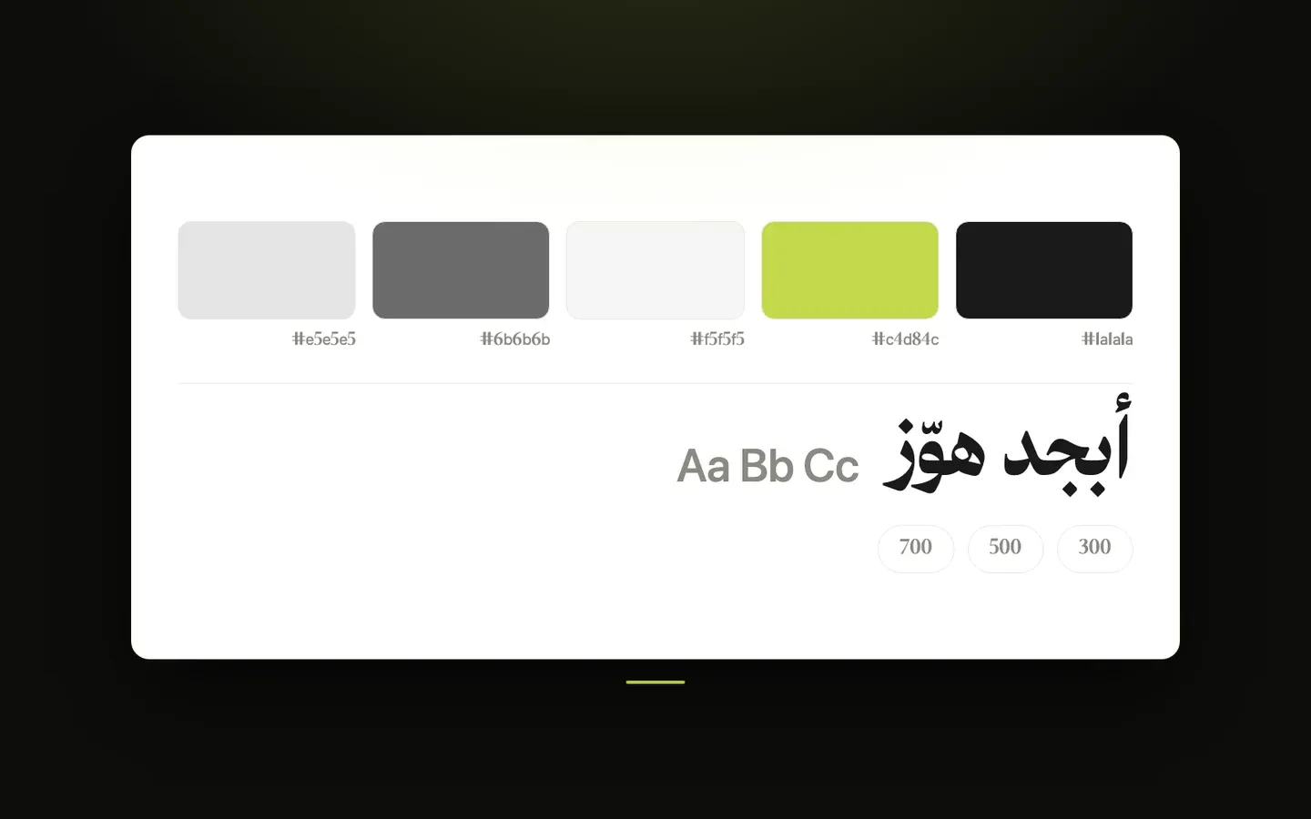
Colors, Fonts & Design
These settings control the overall look of your store on every page: its colors, fonts, light and dark modes, page width, spacing, rounded corners, shadows and a few icons. You'll find them in the theme customizer under Layout, in the Colors, Fonts, Theme Mode, Content Width, Section Spacing, Border Radius, Shadow and Icons tabs.
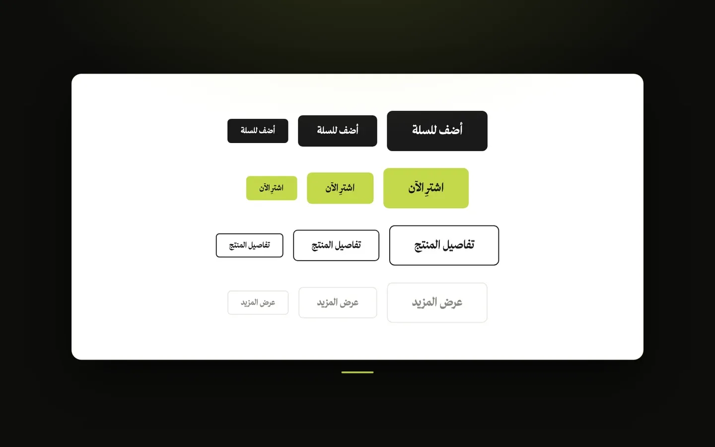
Buttons
These settings control how buttons look and move across your whole store, from their colors and shape to their hover animation. You'll find them in the theme customizer under Layout → Buttons. Sections and product cards that have their own button options can still change their own buttons.
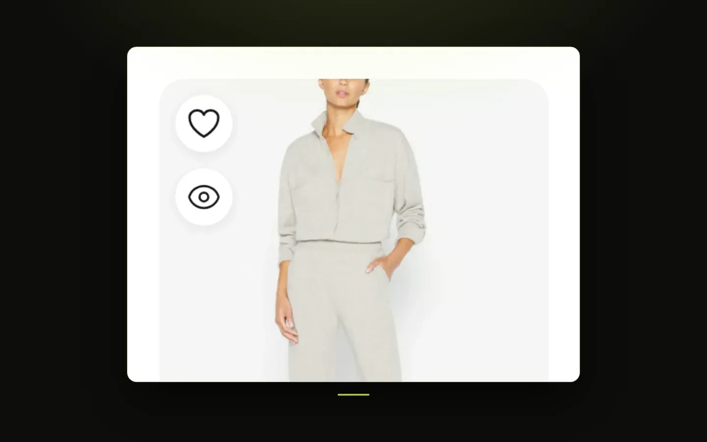
Product & Blog Cards
These settings control how every product card and blog post card looks across your store - on category pages, the all-products page, related products, product sections and the blog - as well as how the quick view popup that opens from product cards looks and behaves. You'll find them in the theme customizer under Layout → Product Card, Layout → Blog Card and Layout → Quick View Popup.
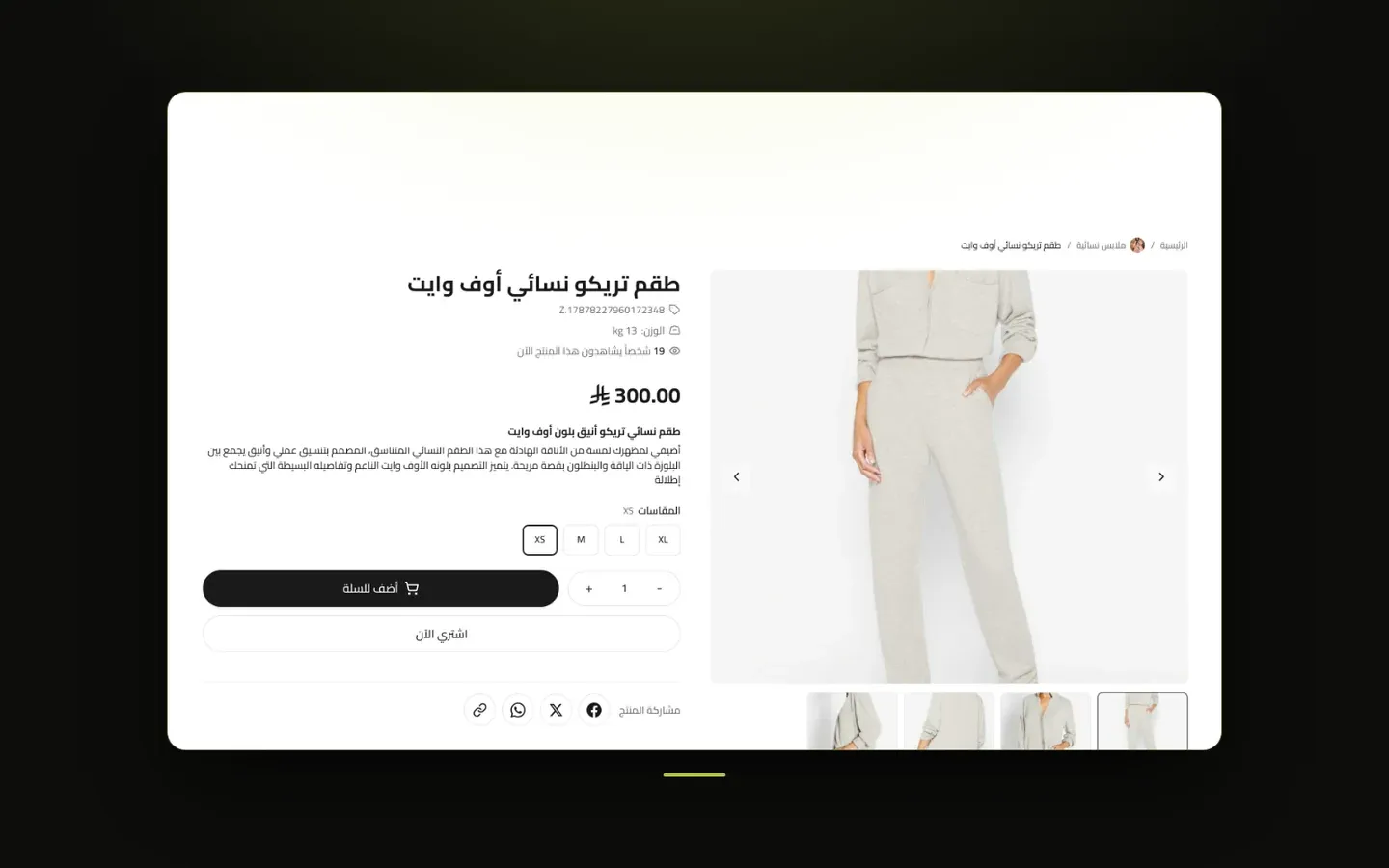
Product Page & Size Guide
These settings control your product pages: the overall layout, which details are shown, the photo gallery, the sticky add-to-cart bar, purchase options, extra texts, buttons, banners and tabs, delivery times by city and fit, material and care details, plus an optional size guide window that shoppers can open while choosing a size. You'll find them in the theme customizer under Layout → Product Page and Layout → Size Guide.

Category & Products Pages
These settings control the page for each category, the page listing all your categories, the images used for categories, and the product grid on the all-products page. You'll find them in the theme customizer under Layout → Category Page, Layout → Categories Page, Layout → Category Images and Layout → Products Page Settings.
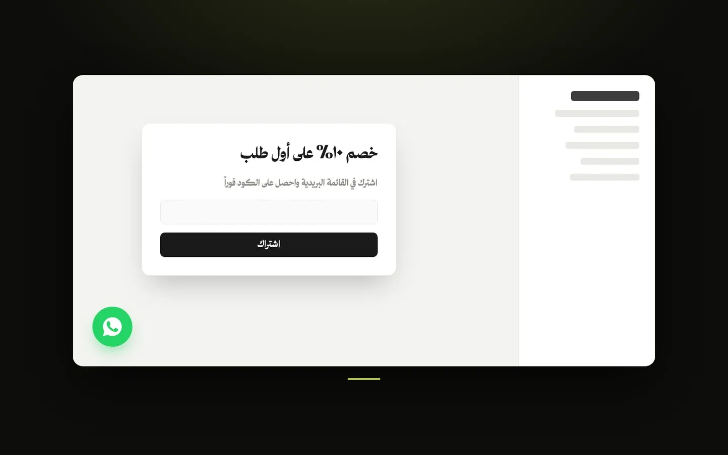
Pop-up, Side Bar & WhatsApp
These settings control the promotional pop-up window, the floating side bar with your social media icons, and the WhatsApp contact buttons shown across your store. You'll find them in the theme customizer under Layout → Newsletter / Promotion Pop-up, Layout → Floating Side Bar, and Layout → WhatsApp Contact.
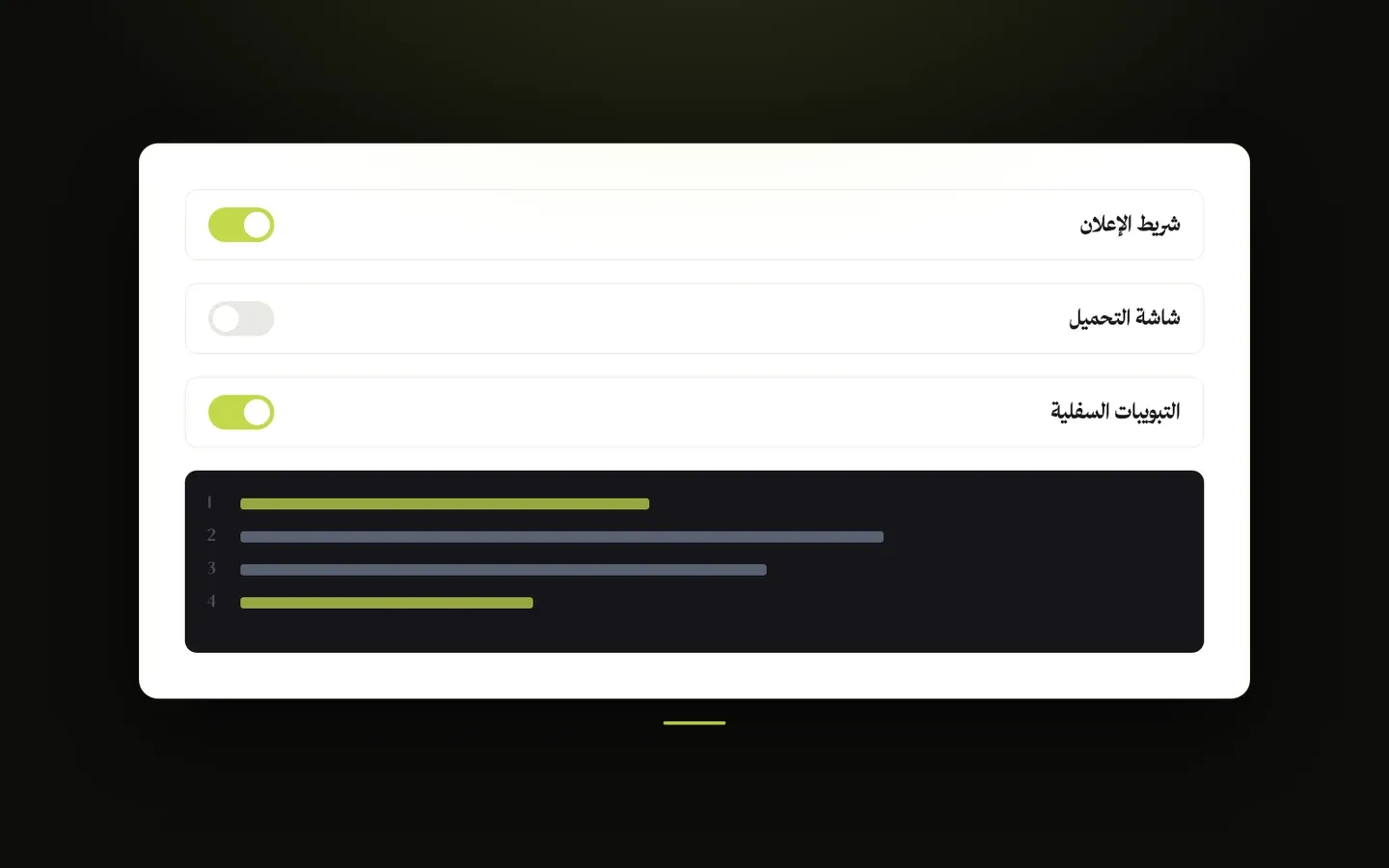
General Settings & Custom Code
Store-wide options such as the back to top button, content protection, the browser tab icon, the loading screen, and a place to add your own code. You'll find them in the theme customizer under Layout → General, Layout → Favicon, Layout → Preloader, and Layout → Custom Code (CSS / JS).
Page sections
Sections you add to your store’s pages and arrange as you like, each with its own settings.
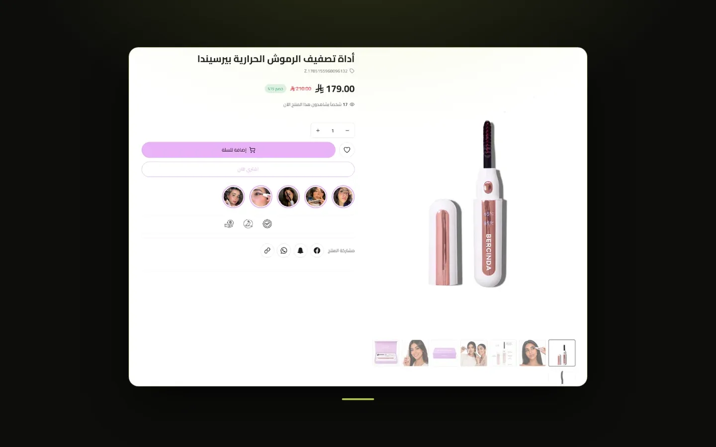
Single Product
A full product detail block that renders one specific product directly on a page - showing its gallery, price, options, and purchase buttons exactly as if a visitor had opened the product page itself. Separate from the theme's main product page (which every product uses automatically); this section is for featuring one chosen product anywhere else.

Custom HTML
An open section for pasting your own custom code - useful for embedding something the theme doesn't have a built-in section for, like a third-party widget or a specially designed banner. Intended for merchants comfortable working with code.

Space
An invisible spacer section used to add extra vertical breathing room between two other sections on a page.
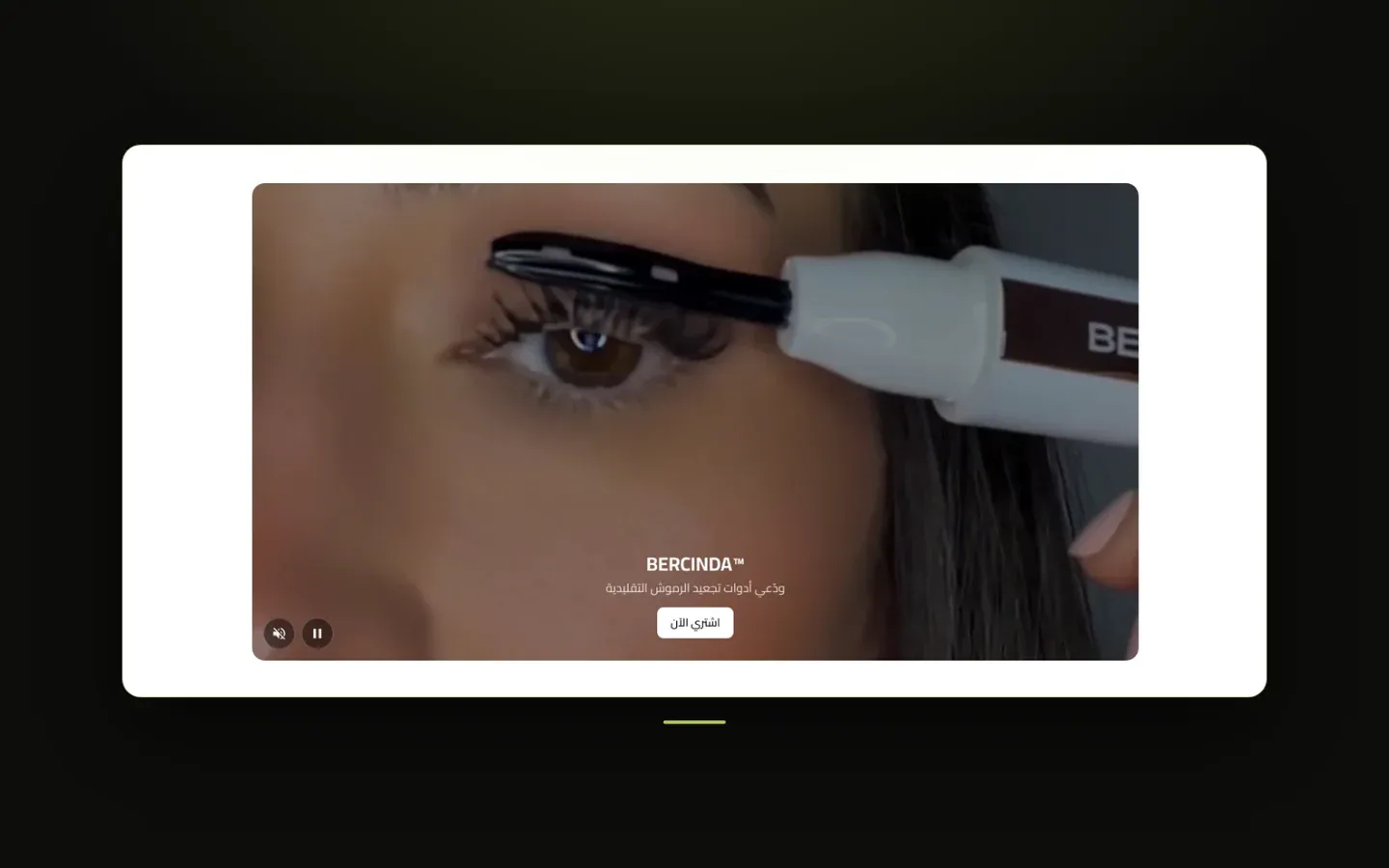
Video
A flexible video showcase supporting uploaded files, direct video links, or YouTube - shown as a single hero video, a grid, a horizontal slider, or a vertical feed, each video with its own optional title, description, and button.

Today Offer
A split promotional section pairing an image or video with a countdown timer, discount badge, and stock indicator - built for a limited-time "deal of the day" style offer.

Photo Gallery
A highly customizable visual gallery that can showcase products, categories, or entirely custom images, in one of several layouts - from a simple horizontal scroller to an animated floating collage.
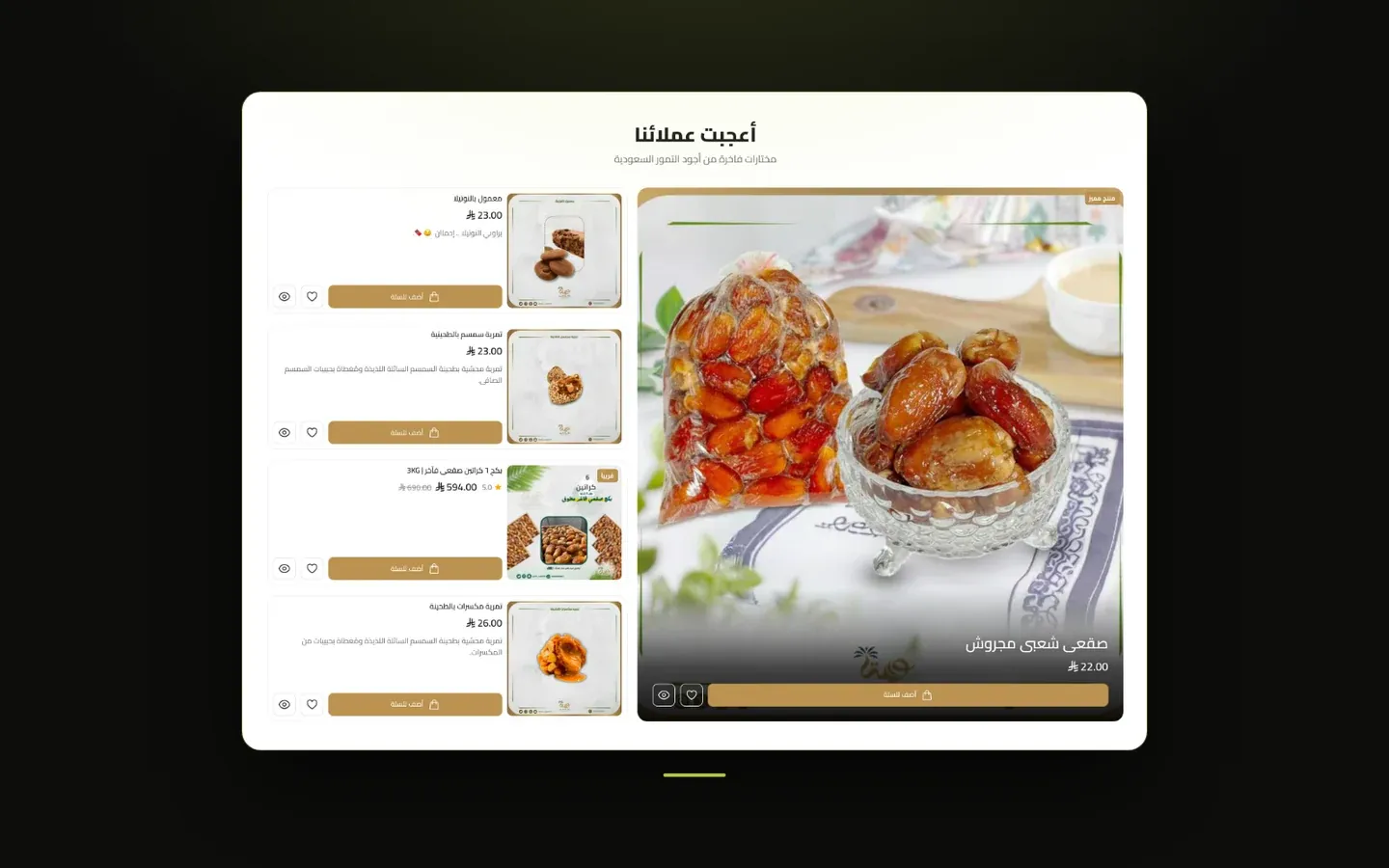
Products Showcase
A richly customizable product display supporting several distinctive layouts - from a large featured product with a side list, to a magazine-style grid, to a hero carousel - for highlighting a hand-picked or automatically chosen set of products.
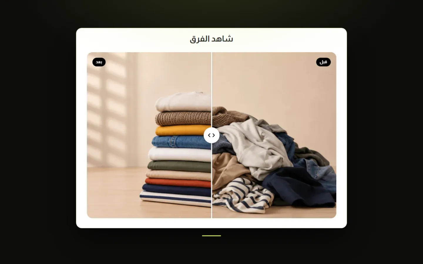
Before & After
A two-image comparison with a draggable divider, letting visitors slide between a "before" photo and an "after" photo - ideal for showcasing a transformation, a renovation, a skincare result, or any before/after story.
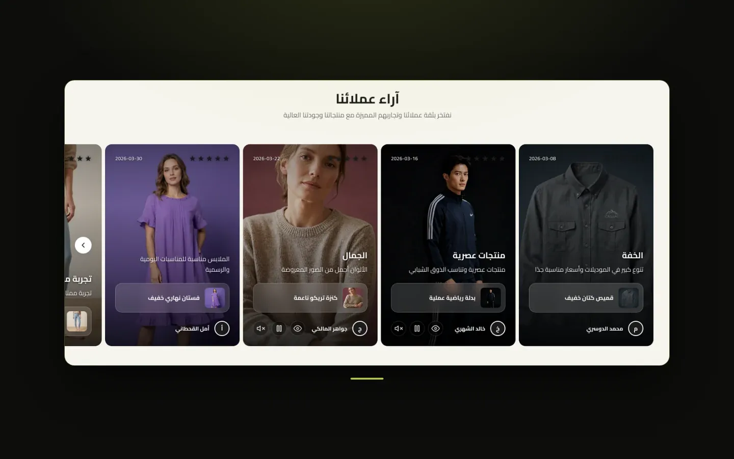
Customer Opinions
A slider of customer reviews and testimonials, each shown as a card with a star rating, quote, and the customer's name - building trust by showing what real customers say.
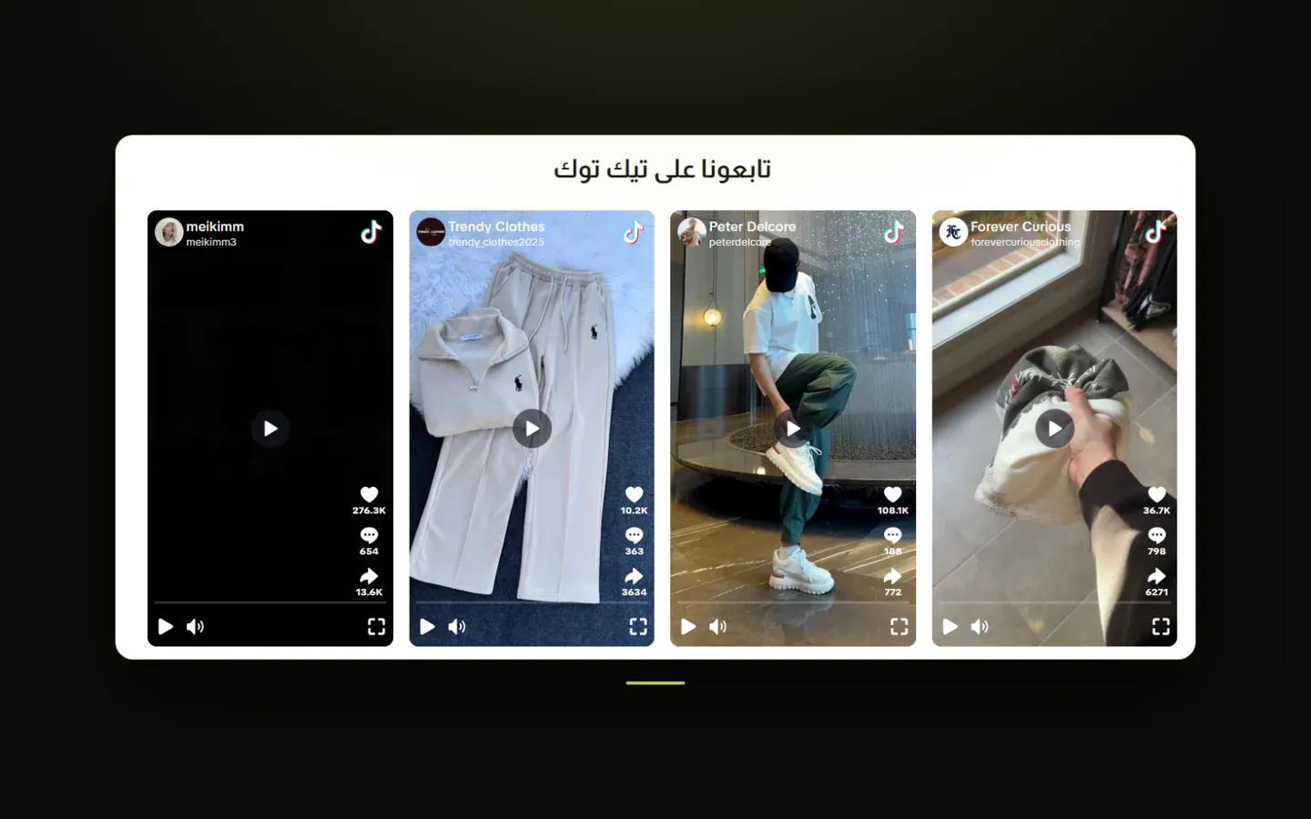
TikTok Feed
A grid or slider of TikTok videos, letting you showcase your brand's TikTok content directly on your storefront, with either the native TikTok look or a lightweight video player.
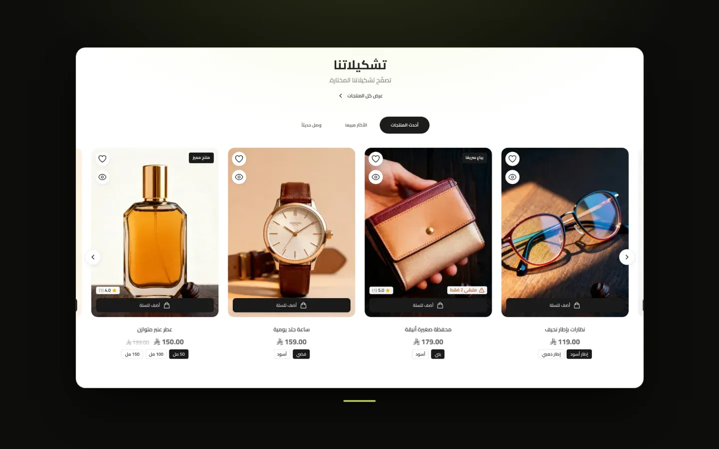
Tabbed Category Products
A product grid or slider organized into tabs, where each tab pulls its products from its own category - letting visitors switch between, for example, "New Arrivals", "Best Sellers", and "Sale" without leaving the section.

Hero Banner (Hero)
The large banner that typically sits at the very top of the homepage, above everything else. It supports a single slide or a slideshow of several slides, each with its own background (image, video, or color gradient), heading text, subtitle, countdown timer, and up to two buttons. This section has no separate section title of its own - each slide carries its own text.

Hero Section (New Version)
A large banner for the top of your homepage that shows one or more banners, each with an image or a video and, optionally, a title, description, statistics, and up to two buttons. It comes in three looks - Two Columns, Overlay Card, and Cinematic Slideshow - and adding more than one banner turns it into a slider that visitors can swipe through.
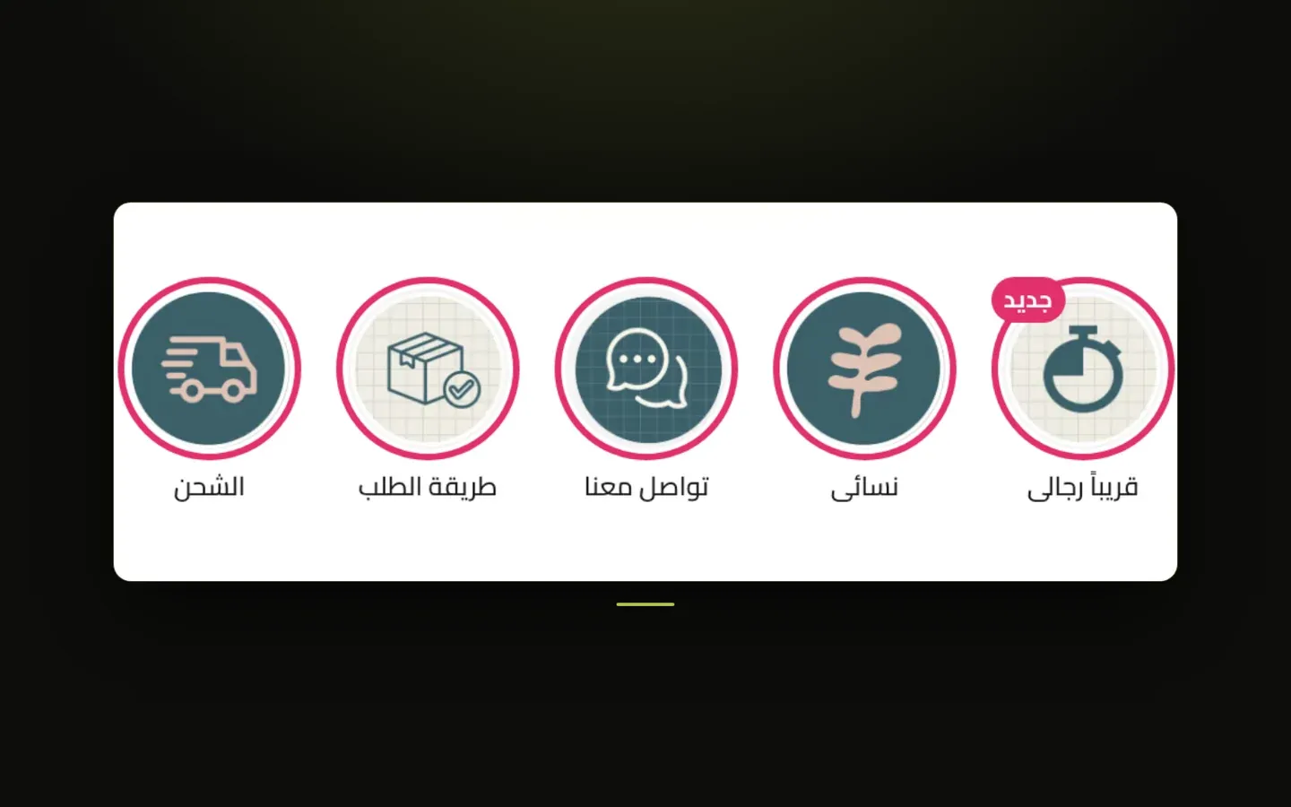
Stories
A row of tappable story circles, similar to social-media stories, each opening a full-screen slideshow of images, videos, or YouTube clips with optional text, buttons, and linked products.
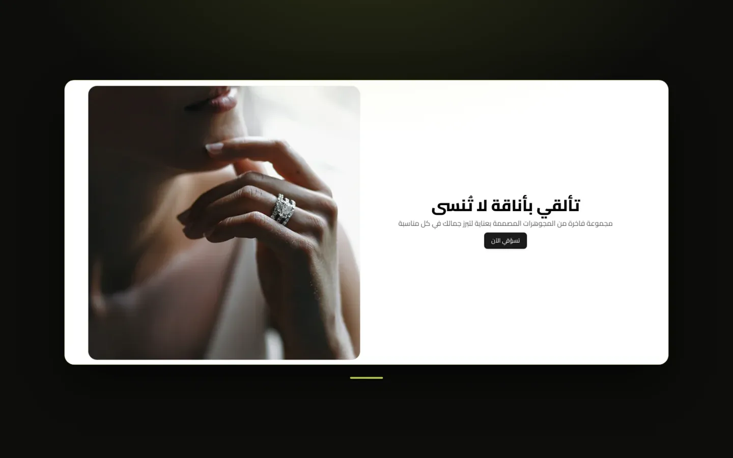
Call to Action (CTA)
A flexible promotional block combining a background (image, video, gradient, or solid color) with a heading and a button - for driving visitors toward a specific offer, page, or action. Can also split into a two- or three-panel layout.
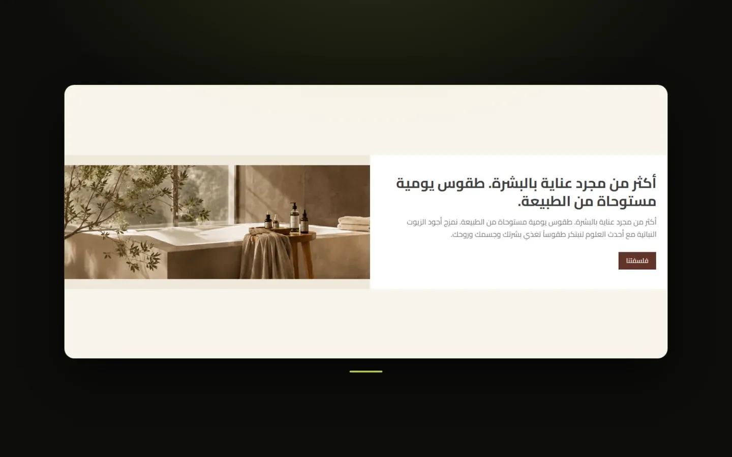
Offers
A flexible set of offer cards, each with its own image, text, and button - good for showing several running promotions at once in different sizes.
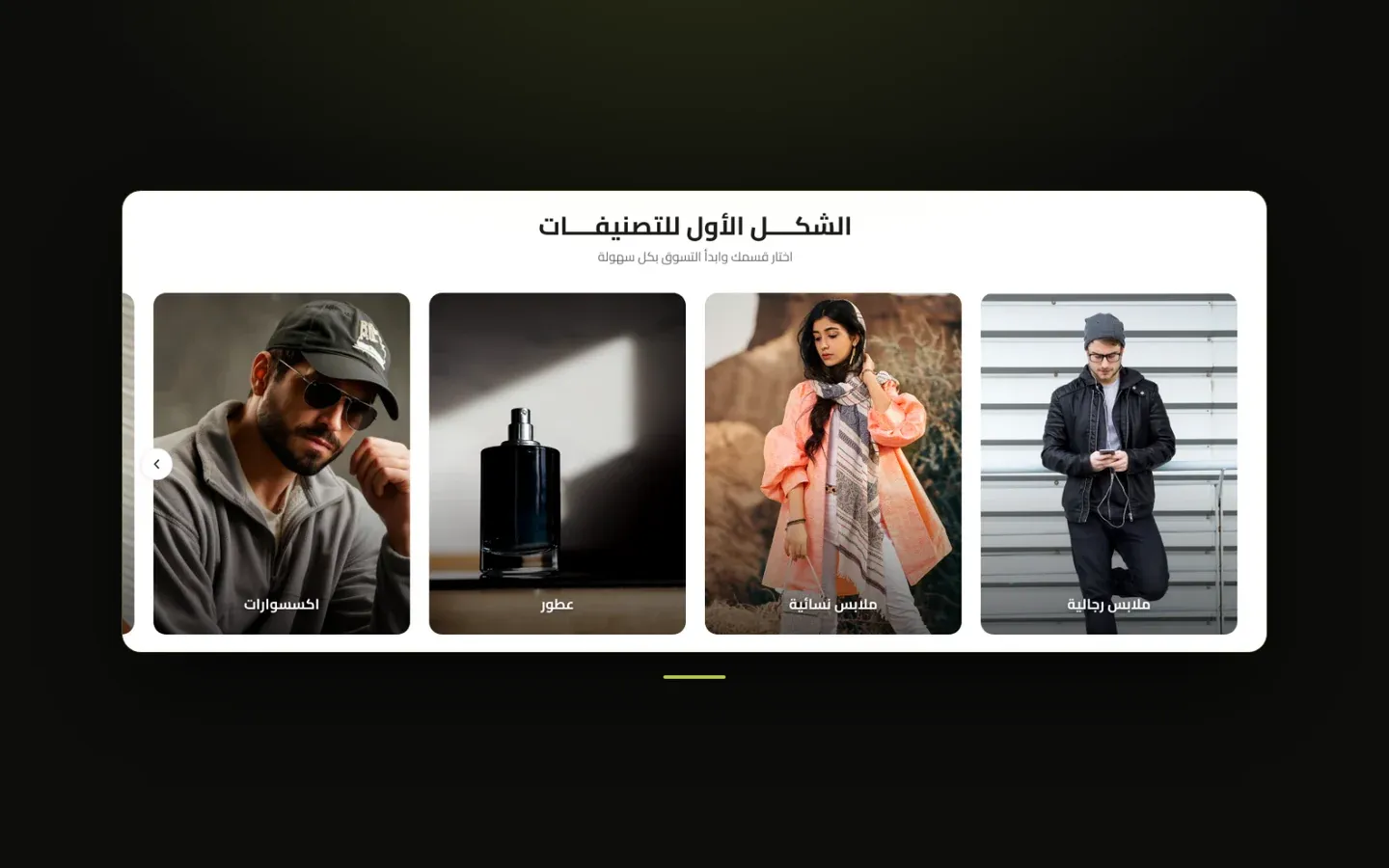
Categories Showcase
A visual showcase of your product categories, letting visitors jump straight into browsing a category. Supports several distinct visual layouts, from clean grid cards to a circular badge layout.
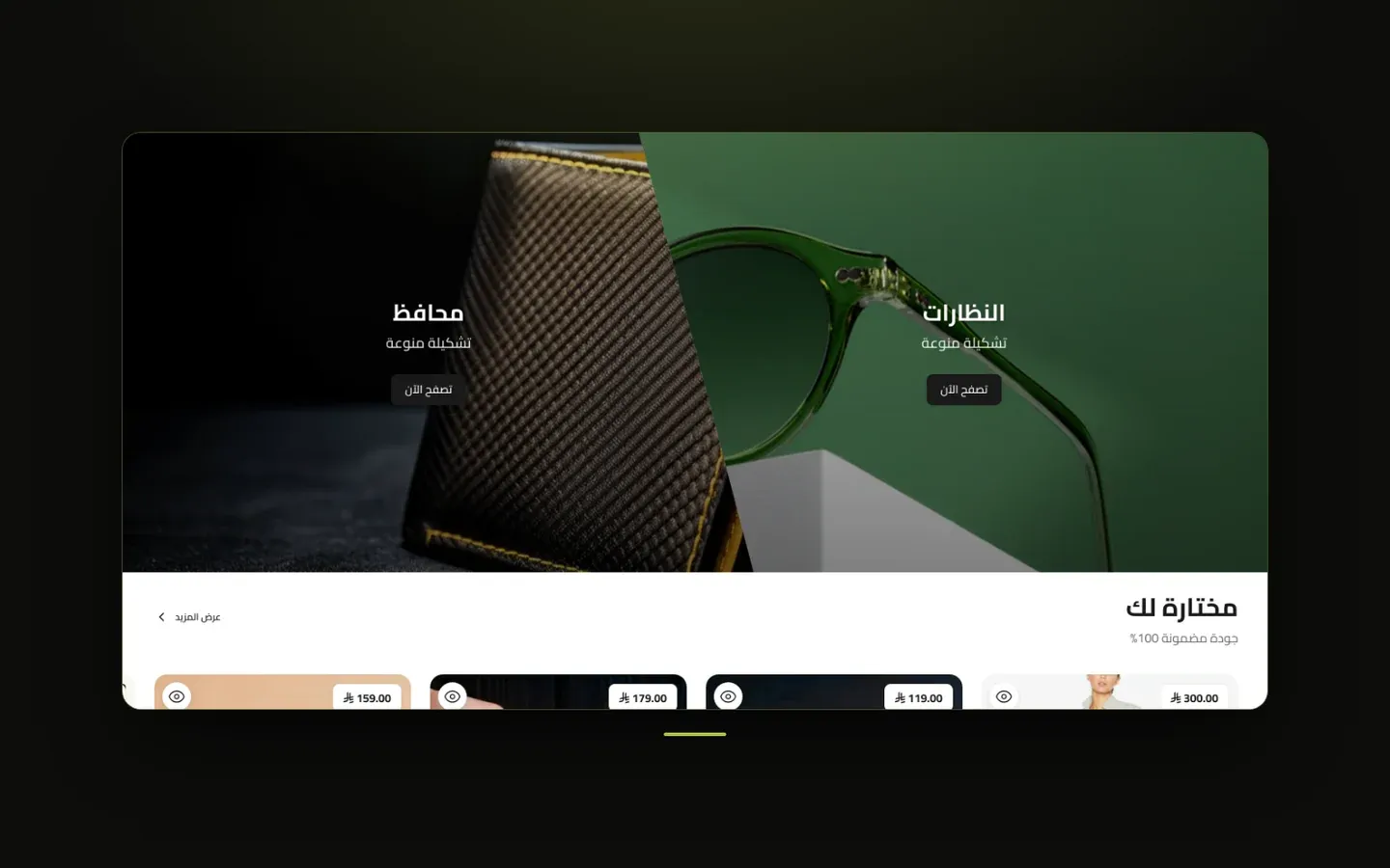
Split Banners
Two banners shown side by side (or stacked), each with its own image or video, heading, and button - good for pairing two related promotions or categories.
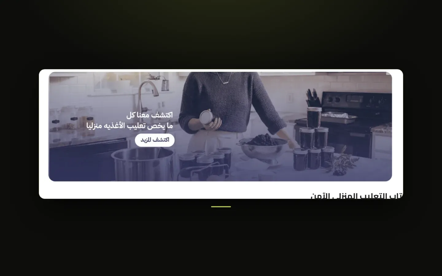
Standalone banner
A full-width or contained image/video banner that can hold a single slide or a slideshow of several slides, each with its own image or video, optional overlay, and optional title text. It appears as its own section wherever you place it on a page.
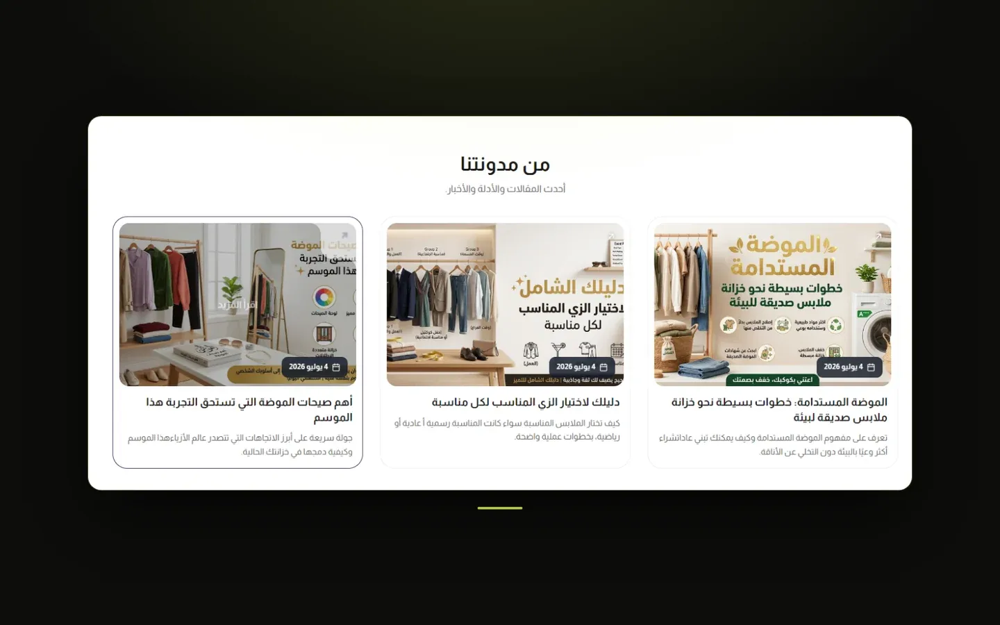
Blog Posts
A grid of your latest blog articles, each shown as a card with its cover image, title, and excerpt - a way to surface your store's blog content on any page.
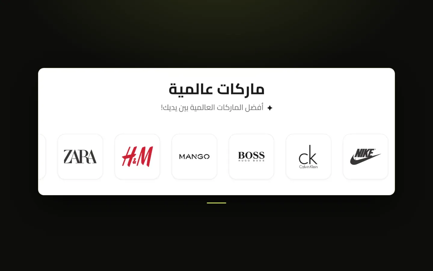
Brand Slider
A strip of brand or partner logos, either scrolling continuously or shown still, useful for showing the brands you carry, press mentions, or partner companies.
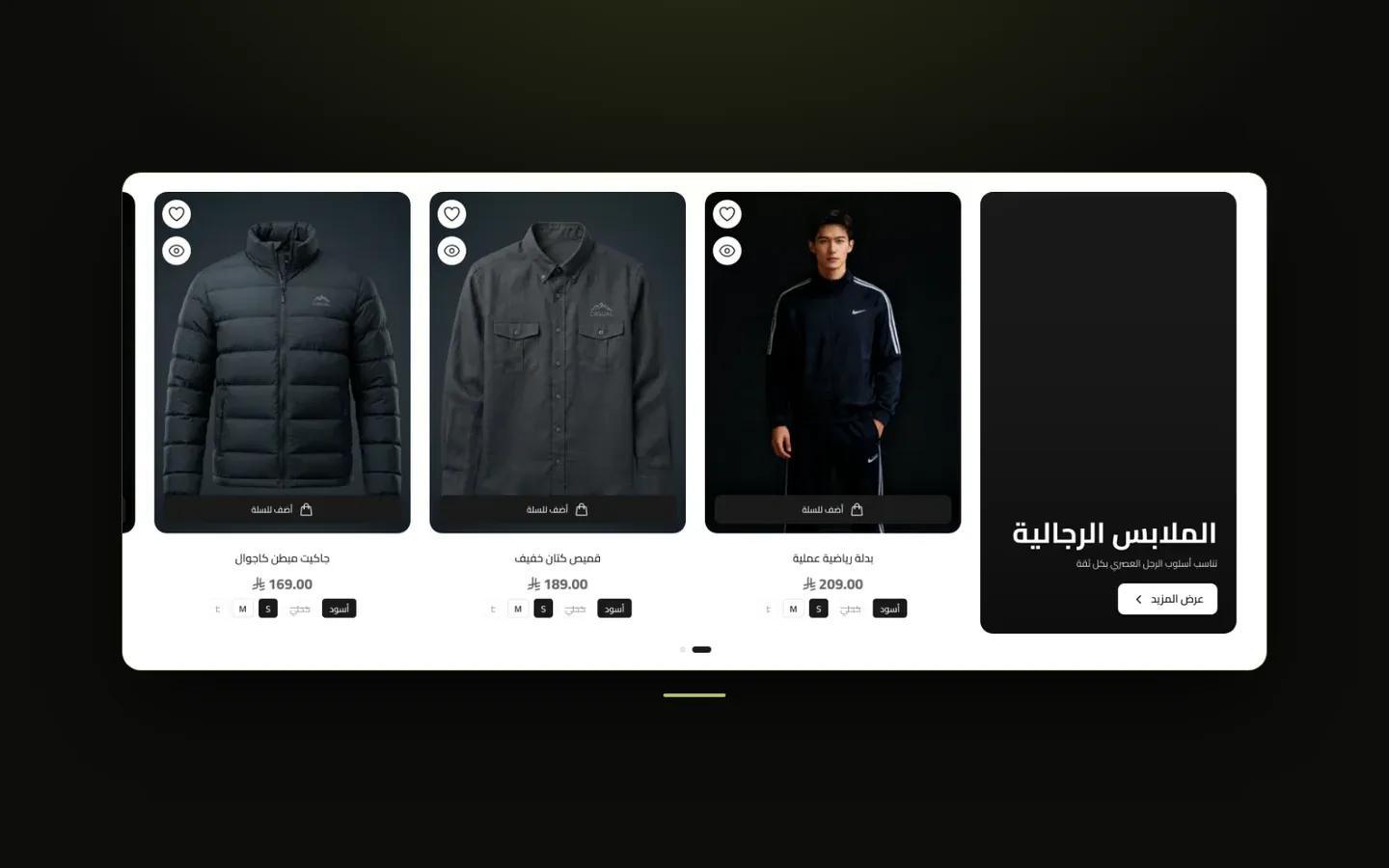
Products
A grid or slider of products pulled automatically from one category you choose, optionally paired with a highlighted card for the category itself.
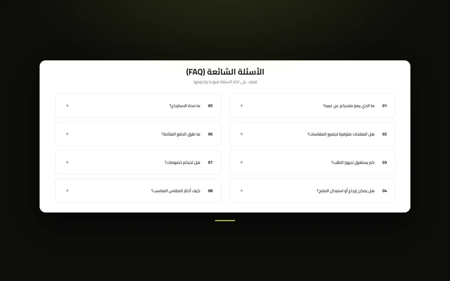
FAQ Section
An expandable list of frequently asked questions, either pulled automatically from your store's FAQ page or written specifically for this section.
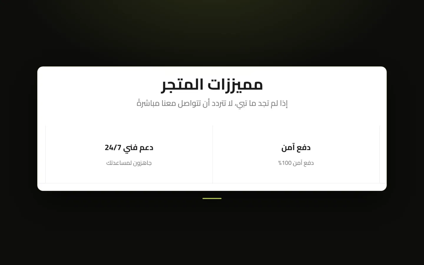
Features Bar
A row of short highlights - like free shipping, secure payment, or 24/7 support - each with a small icon, a title, and a one-line description. Commonly placed near the top or bottom of the homepage to build trust quickly.
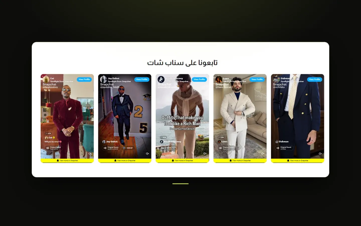
Snapchat Feed
A grid or slider of Snapchat Spotlight videos, letting you showcase your brand's Snapchat content directly on your storefront.

Reviews & Follow Us
A two-part trust section: an overall star rating with a photo strip on one side, and a "follow us on Instagram" prompt with its own photo strip on the other. Either part can be shown on its own.
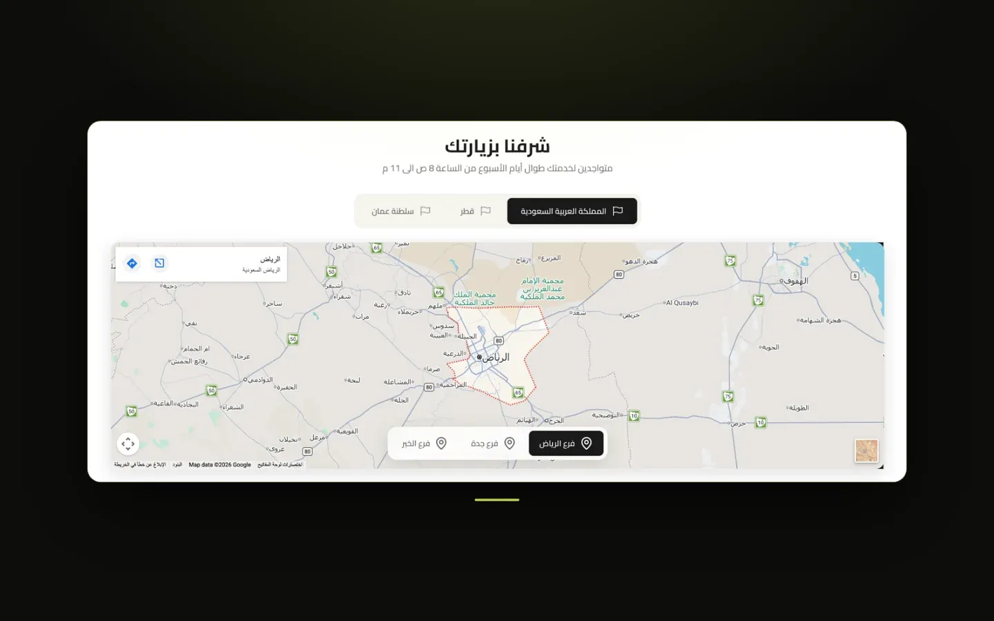
Store Locations
A section listing your physical store branches, organized by country and city, each with an embedded map - useful for merchants with multiple physical locations.

Tabbed Showcase
A general-purpose card showcase organized into tabs - unlike Tabbed Category Products, each card here is written and linked manually rather than pulled from a category, making it suited to featured content, guides, or curated picks grouped by topic.

Who are we
A brand-story section pairing an image with a description of your business - good for an "About Us" style block on the homepage.

Promotional Banners
A set of simple image banners shown together in a grid or slider - useful for a row of quick promotions, categories, or campaign images.
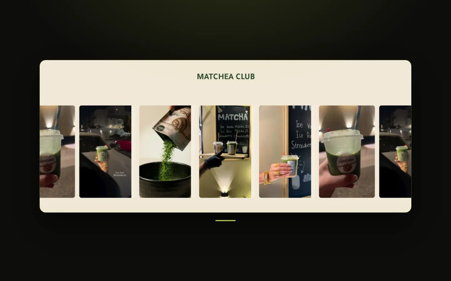
Media Marquee
A continuously moving strip of images and short videos that glides across the screen on its own - great for lifestyle photos, product shots, or social-style clips.

Scrolling Strip
A bold, continuously moving band of words or logos that runs across the full width of the screen - ideal for slogans, promotions, or brand names. Choose between oversized Large Text or colored Crossed Ribbons that tilt across each other.
Category Banner + Products
A large banner for one of your categories shown beside a grid or slider of products, so you can spotlight a collection and its items together in one section.
Collection Cards
A set of image cards that each showcase one of your store's categories, with the category name and a shopping button - shown as a grid or a swipeable slider so visitors can jump straight into a collection.
Image Group
A set of image cards shown as a slider or a grid, each with an optional title, description, button, and link - great for showcasing collections, lookbooks, or promotions.
Shoppable Image (Hotspots)
A large lifestyle or lookbook photo with small clickable dots placed on top of it, each one linked to a product. When a visitor taps a dot, a small product card pops up with the product's photo, name, and price, and clicking that card opens the product page - a natural way to let shoppers buy exactly what they see in the picture.
Shop the Look
A large background video or photo of a look, with the products that make up that look shown on product cards floating over it - so visitors can watch the look and add its pieces to their cart in one place. On desktop the cards sit in a small panel over the bottom of the background; on phones they appear in a swipeable row just below it.
Inside pages
Your next step
starts with a conversation.
Tell us about your store. We'll come back with a clear view of what it needs — and a written proposal before any commitment.