

Footer
On this page 13
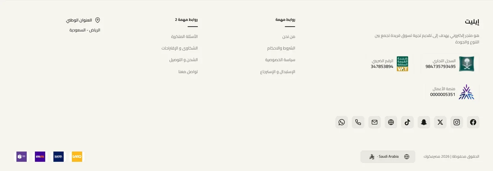
The footer is the area at the very bottom of every page of your store, where your logo, a short description, link columns, app download badges, contact and certificate details, copyright, and payment and shipping icons appear. You’ll find these settings in the theme customizer under Footer, and the last group on this page is under Layout → Internal Pages Footer Style.
Branding
These settings fill the brand area of the footer. They are shown in Style One (Default), where they sit in the first column, and in Style Two (Centered), where they are centered at the top. Modern shows the logo (or the brand name, when no logo is uploaded) and the description, but not the copyright line under the description. The Simple (Copyright & Social) style does not show them.
- Brand Name - your store name shown as text in the footer. If you leave it empty and have not uploaded a logo, your store’s name from Zid is shown instead. If you upload a logo and leave this empty, only the logo is shown.
- Brand Description - a short paragraph about your store, shown below the name.
- Show copyright under brand description - when on, your copyright line is also shown just below the brand description. It uses the Copyright Text from Bottom Bar, or your store’s copyright text from Zid if that is empty.
- Logo (Light Mode) - the logo shown in the footer when the store is displayed in light mode. It is also used in dark mode if you don’t upload a dark mode logo. In Style Two (Centered) the logo appears larger.
- Logo (Dark Mode) - a separate logo shown when the store is displayed in dark mode, useful when your normal logo is hard to see on a dark background.
Typography
- Headings Font Weight - how bold the column headings, the brand name, and the Mobile App heading appear: Default, or from Light to Extrabold.
- Text & Links Font Weight - how bold the footer links, the brand description, and the copyright text appear: Default, or from Light to Bold.
- Column Description Font Weight - how bold the description text under column headings appears. Default (same as text) follows Text & Links Font Weight, or choose from Light to Extrabold.
Layout
- Footer Style - the overall look of the footer. Style One (Default) places your brand area in a wider first column followed by your link columns side by side, with a bottom bar underneath. Style Two (Centered) starts with a soft wavy edge and stacks everything in the center: logo, name, description, social icons, app badges, then your link columns in a centered row, and the bottom bar. Simple (Copyright & Social) is one slim row with only the app badges, your social media icons, and the copyright line, stacked on phones. Modern is a newer design with five layouts of its own, chosen under Modern footer: layout below. It also shows buttons for your store’s phone number and email, a WhatsApp button if you turned on Show beside social icons in footer in the WhatsApp settings, and your verification badges. Your social media icons come from the contact details in your Zid store settings.
Layout - Modern footer: layout
These settings only appear when Footer Style is set to Modern.
- Layout - how the Modern footer is arranged. Three columns places your logo and description in the middle with your link columns split on either side, then a contact strip with your phone, email and social media icons, then a shaded bottom bar with the copyright, country selector, and payment and shipping icons. Compact puts your logo, description and contact buttons in a narrow first column with your link columns beside it, and moves the social media icons into the bottom bar next to the payment and shipping icons. Floating card is the Three columns layout inside a rounded card with a soft shadow, floating above the page background. Wave is the Three columns layout with a wavy top edge. Classic puts your logo, description, contact buttons and social media icons in the first column, your link columns in the middle, and the payment and shipping icons in their own last column, with a plain bottom bar for the copyright and country selector.
- Logo height (0 = auto) - the height of the footer logo, up to 120 pixels. At 0 the logo uses the layout’s own size: largest in Three columns, Floating card and Wave, and smallest in Classic. Values below 20 are shown at 20.
- Divider style - the look of the lines that separate the parts of the Modern footer, such as the line above the contact strip and the line above the bottom bar: Solid, Dashed, Dotted, Double, or None. Their color comes from Separator Line Color under Colors.
Layout - Modern footer: links
- Lists in first column - for the Three columns, Floating card and Wave layouts: how many of your link columns (from Columns List) go on the first side, from 0 to 8. The remaining ones go to the third column. At 0 they are split automatically, about half on each side.
- Collapse links on mobile - when on, each link column on phones and tablets shows only its heading, and tapping the heading opens its links. Opening one closes the others. On large screens all links are always shown.
- Center links - centers the headings and links of your link columns.
Layout - Modern footer: positions
Choose where each of these items appears in the Modern footer: Middle (under your logo and description), First column or Third column (under the link columns on that side), With contact (in the contact strip), Bottom bar, or Hide. First column, Third column and With contact only apply to the Three columns, Floating card and Wave layouts. In Compact and Classic, they work like Middle and place the item in the first column under your contact buttons.
- Address position - where your national address appears. Clicking it opens the location on Google Maps. It only shows when Show National Address below is on and your national address is set to be shown in your Zid store settings.
- Badges position - where your verification badges appear: commercial registration number, VAT number, and Saudi Business Center verification. Each badge only shows when that detail is added, and set to be shown, in your Zid store settings.
- App badges position - where the App Store and Google Play badges from Mobile App appear.
Layout - Modern footer: payment & shipping
- Payment methods title - when on (the default), a small “Payment methods” heading appears above the payment icons, linking to your shipping and payment page. When off, only the icons are shown.
- Shipping methods title - the same for the “Shipping methods” heading above the shipping company icons.
Layout
- Footer Columns - Desktop - how many columns the footer is divided into on large screens, counting the brand column, from 1 to 8. For example, 4 means the brand column plus three more. Extra link columns wrap onto a new row. On tablets the footer always uses two columns and on phones one column. Only used by Style One (Default).
- Brand Column Width (multiplier) - how many times wider the brand column is than each of the other columns on large screens, from 1 (same width) to 8. Only used by Style One (Default).
- Show National Address - when on, shows your national address (city and country) with a map pin, linking to the location on Google Maps. It only appears if your national address is added and set to be shown in your Zid store settings. Applies to Style One (Default), Style Two (Centered) and Modern, where its place is set by Address position.
- Commercial Registration Certificate - an image of your commercial registration certificate. The commercial registration badge only shows when your commercial registration number is added in your Zid store settings; uploading an image here makes that badge clickable so visitors can open the certificate. If left empty, the certificate from your Zid store settings is used, if there is one. Applies to Style One (Default), Style Two (Centered) and Modern.
- Space Between Column Name and Links - Desktop (px) - the space between each column heading (and its description) and the links below it, on large screens. Applies to Style One (Default), Style Two (Centered) and Modern.
- Space Between Column Name and Links - Tablet (px) - the same space, on tablets.
- Space Between Column Name and Links - Mobile (px) - the same space, on phones.
- Space Between Column Links - Desktop (px) - the space between the links in each column, on large screens. Applies to Style One (Default), Style Two (Centered) and Modern.
- Space Between Column Links - Tablet (px) - the same space, on tablets.
- Space Between Column Links - Mobile (px) - the same space, on phones.
- Show Underline Below Column Heading - when on, a short colored line appears under each column heading (or under its description, when the column has one). Only used by Style One (Default).
- Show Divider Line Above Language Bar - when on, a thin line separates the bottom bar (with the copyright, country selector, and payment icons) from the rest of the footer. Applies to Style One (Default), Style Two (Centered) and Modern, where the line follows Divider style.
Colors
- Footer Background Image - an optional picture shown behind the footer. Works with every footer style.
- Footer Background Image - Dark Mode - a separate background picture for dark mode. If left empty, the normal background image is used in dark mode too.
- Background Image Position - which part of the background image stays in view when it is cropped: Center, Top Center, Bottom Center, Left Center, Right Center, Top Left, Top Right, Bottom Left, or Bottom Right.
- Background Image Size - how the background image fills the footer: Cover fills the whole area and may crop the image, Contain shows the whole image, Original Size keeps the image at its own size, and Stretch pulls the image to fill the area exactly.
- Background Image Repeat - whether a smaller background image repeats to fill the space: No Repeat, Repeat, Repeat Horizontally, or Repeat Vertically.
- Background Color - the footer background color in light mode. If left empty, the theme’s surface color is used.
- Primary Text Color - the main text color, used for example on the social media icons, the country selector, the certificate numbers, and the national address.
- Heading Color - the color of the column headings, the brand name, and the Mobile App heading.
- Secondary/Muted Text Color - a softer color used for the footer links, the brand description, column descriptions, and the copyright text.
- Border Color - the color of the thin outlines around the social media icons, the country selector, the certificate badges, and the payment and shipping icons when shown as White boxes.
- Separator Line Color - the color of the line above the bottom bar, and of the line along the top edge of the footer in Style One (Default) and Simple (Copyright & Social), and of the divider lines in Modern.
- Heading Underline Color - the color of the short line under column headings. If left empty, the theme’s accent color is used. Only used by Style One (Default).
- Link Hover Color - the color footer links change to when a visitor points at them. If left empty, the theme’s secondary color is used.
- Background Color (Dark Mode) - the footer background color in dark mode.
- Primary Text Color (Dark Mode) - the main text color in dark mode.
- Heading Color (Dark Mode) - the heading color in dark mode.
- Secondary Text Color (Dark Mode) - the softer text color in dark mode.
- Border Color (Dark Mode) - the outline color in dark mode.
- Separator Line Color (Dark Mode) - the separator line color in dark mode.
- Heading Underline Color (Dark Mode) - the column heading underline color in dark mode. If left empty, the theme’s accent color is used.
- Link Hover Color (Dark Mode) - the link hover color in dark mode. If left empty, the theme’s secondary color is used.
Columns
Link columns are shown in Style One (Default) next to the brand column, and in Style Two (Centered) as a centered row. In Modern they are arranged by the chosen Modern layout, without column descriptions or link icons. The Simple (Copyright & Social) style does not show them.
- Columns List - each item in the list is one footer column, with the fields below.
- Heading - the column title, such as “Customer Service”.
- Description - optional short text shown under the heading.
- Links - the list of links inside this column. Each link has the fields below.
- Link Name - the text visitors see for the link.
- Link URL - the page the link opens.
- Icon (Image - optional) - a small picture shown before the link name.
- Icon (SVG code - optional) - paste the icon’s SVG code here to show it before the link name. If you fill in both icon fields, this one is used.
Mobile App
Badges linking to your store’s app, shown in every footer style. In Modern, App badges position sets where they appear. They appear in the store’s current language (Arabic or English), and nothing is shown if both links are empty.
- Section Heading (optional) - a short heading shown above the app badges, such as “Download our app”. Leave it empty to show the badges without a heading.
- App Store Link - the link to your app on the App Store. Leave it empty to hide the App Store badge.
- Google Play Link - the link to your app on Google Play. Leave it empty to hide the Google Play badge.
- Solid badges - when on (the default), the App Store and Google Play badges are black with white lettering. When off, they use the outline style instead.
Bottom Bar
The bottom bar is the strip at the very bottom of the footer in Style One (Default), Style Two (Centered) and Modern. In the Modern Classic layout, the payment and shipping icons sit in their own column instead of the bar. In Simple (Copyright & Social), only the copyright settings apply.
- Show Bottom Bar - when on, the bottom bar is shown. Turning it off hides the whole bar, and in the Simple style it hides the copyright line.
- Show Copyright in Bottom Bar - when on, your copyright line is shown in the bottom bar.
- Copyright Text - the copyright line, such as “All rights reserved”. If left empty, your store’s copyright text from Zid is used.
- Show Country Selector - when on, a button showing the visitor’s current country and currency appears; clicking it lets them change country and currency. Not shown in the Simple style.
- Show Payment Methods - when on, the icons of the payment methods enabled in your store are shown. Clicking them opens your shipping and payment page. Not shown in the Simple style.
- Show Shipping Methods - when on, the icons of the shipping companies enabled in your store are shown, also linking to your shipping and payment page. Not shown in the Simple style.
- Payment & Shipping Icons Style - how the payment and shipping icons look: Plain (no background), Soft rounded (each icon on a light, fully rounded background), or White boxes (each icon in a white box with a thin outline). Not used by Modern, which always shows the icons in small white boxes.
Internal Pages Footer Style
This group is found in the theme customizer under Layout, not under Footer. It lets you use a different footer style on every page except the home page.
- Footer Style (Other Pages) - the footer style used on all pages other than the home page. Same as Global keeps the Footer Style chosen under Footer → Layout. Style One (Default), Style Two (Centered), Simple, and Modern switch those pages to that style, while the home page keeps the main Footer Style.