

Colors, Fonts & Design
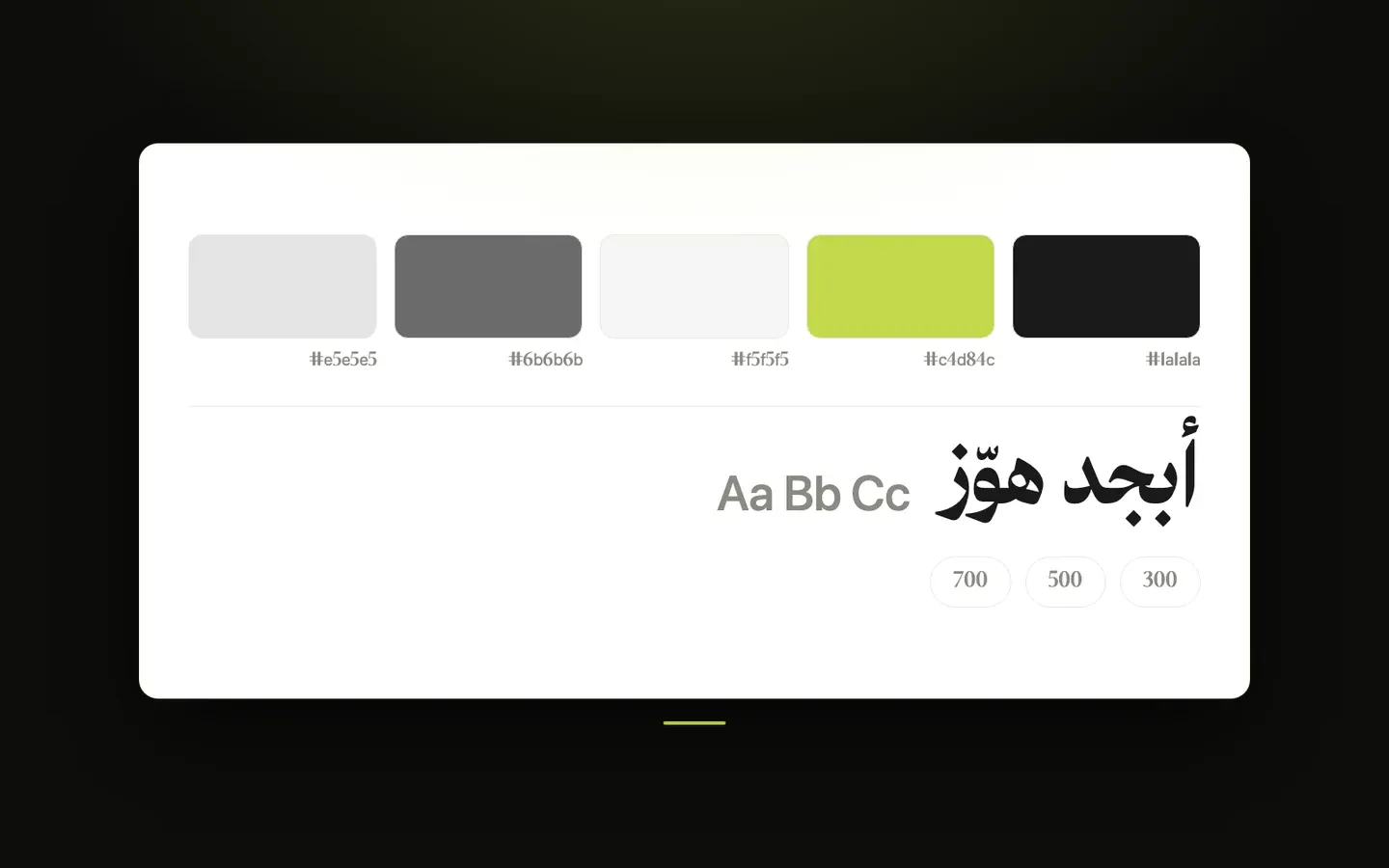
These settings control the overall look of your store on every page: its colors, fonts, light and dark modes, page width, spacing, rounded corners, shadows and a few icons. You’ll find them in the theme customizer under Layout, in the Colors, Fonts, Theme Mode, Content Width, Section Spacing, Border Radius, Shadow and Icons tabs.
Colors
Each color comes in two versions: a Light one, used when the store is shown in light mode, and a Dark one, used in dark mode (see Theme Mode below). Many sections have their own color options, and those take priority over these store-wide colors.
- Light — Page Background - the main background color of every page.
- Light — Primary Text - the main color for headings and regular text.
- Light — Secondary / Muted Text - a softer color for less important text, such as descriptions, small labels and hints.
- Light — Primary Borders - the color of standard borders and dividers, such as around input fields and Outline buttons.
- Light — Subtle Borders - a lighter color for faint borders and divider lines, such as around cards and under the header.
- Light — Primary / Button Color - your main highlight color, used for links, active items, focus outlines and other accents. Some parts of the theme, and buttons when Button Color Source (in Layout → Buttons) is set to Store Brand Color, use the brand color set for your store in Zid instead, and fall back to this color when no brand color is set.
- Light — Button Hover Color - the background color of primary buttons while a visitor points at them, when buttons use the theme colors (Button Color Source set to Theme Accent Color or Custom Colors). It’s also used for a few other hover highlights, such as the pop-up button.
- Light — Secondary Color - a supporting color, used as the hover color of footer links when the footer doesn’t have its own link hover color. If left empty, your store’s secondary brand color is used, or otherwise Light — Primary / Button Color.
- Light — Base White (Adapts in Dark Mode) - the “white” used for many light backgrounds and light text, such as dropdown lists, category cards and the cart drawer. In dark mode, Dark — Base White Override is used instead, so these areas turn dark too.
- Light — Base Black (Adapts in Dark Mode) - the “black” used for some dark text and hover highlights, such as active tabs and category cards when pointed at. In dark mode, Dark — Base Black Override is used instead.
- Light — Section / Surface Background - a soft background for highlighted areas, such as page headers, the cart summary, image placeholders and Secondary buttons.
- Light — Surface Hover Color - a slightly deeper version of the surface background, shown when a visitor points at some of those areas, such as Secondary buttons.
- Light — Card Background - the background of cards and floating panels, such as product cards, dropdown and mega menus, and pop-ups.
- Light — Shadow Color - the color of the soft shadows under floating elements, such as dropdowns, drawers and the bottom tab bar. The theme automatically makes it very see-through.
- Light — Overlay Color - the color of the dimmed layer that covers the page behind pop-ups, the search window and side menus. The theme automatically makes it partly see-through.
- Dark — Page Background - the main page background color in dark mode.
- Dark — Primary Text - the main text color in dark mode.
- Dark — Secondary / Muted Text - the softer text color in dark mode.
- Dark — Primary Borders - the standard border and divider color in dark mode.
- Dark — Subtle Borders - the faint border color in dark mode.
- Dark — Primary / Button Color - the main highlight color in dark mode. A light color works best so buttons and links stand out on the dark background.
- Dark — Button Hover Color - the primary button hover color in dark mode.
- Dark — Secondary Color - the supporting color in dark mode. If left empty, your store’s secondary brand color is used, or otherwise Dark — Primary / Button Color.
- Dark — Section / Surface Background - the soft background for highlighted areas in dark mode.
- Dark — Surface Hover Color - the surface hover color in dark mode.
- Dark — Card Background - the background of cards and floating panels in dark mode.
- Dark — Shadow Color - the shadow color in dark mode. It’s shown a little stronger than in light mode so shadows stay visible.
- Dark — Overlay Color - the color of the dimmed layer behind pop-ups and side menus in dark mode, shown a little darker than in light mode.
- Dark — Base White Override (Dark BG in Dark Mode) - the color that replaces Light — Base White in dark mode. It should be a dark color, so light panels turn dark. By default it matches the dark page background.
- Dark — Base Black Override (Light Text in Dark Mode) - the color that replaces Light — Base Black in dark mode. It should be a light color. By default it matches the dark primary text.
- Custom — Static White (for images/overlays) - a white that stays the same in light and dark mode, used where text or buttons sit on top of photos, such as banner titles, and for White buttons.
- Custom — Static Black - a black that stays the same in light and dark mode, used for example for the label of White buttons and their hover background.
Fonts
Choose one font for Arabic and one for English. The Arabic font is used when your store is viewed in Arabic, with the English font filling in for any characters it doesn’t include. The English font is used when your store is viewed in English. You can also give headings their own font in each language, such as section titles, page titles and footer headings, while the rest of the text keeps the main font.
- Arabic — Font Source - Google Fonts lets you pick from a ready-made list. Custom Font lets you use your own font from a link.
- Arabic — Select Google Font - the Arabic font: Cairo, Tajawal, Almarai, IBM Plex Sans Arabic, Noto Sans Arabic, Readex Pro, El Messiri, Changa, Baloo Bhaijaan 2, or Rubik. Only shown when Arabic — Font Source is Google Fonts.
- Arabic — Font Family Name - the exact name of your custom font. It’s required when you paste a CSS link and must match the font name written inside that file; for a direct font file link it’s optional. Only shown when Arabic — Font Source is Custom Font.
- Arabic — Font file or CSS URL - the link to your font: either a font file ending in .otf, .ttf, .woff or .woff2 (links to files on GitHub work too), or a CSS file link that loads the font. With a font file link, only one regular weight is loaded, so bold text is thickened automatically by the browser. If the link is empty, or a CSS link has no font name, your custom font isn’t applied. Only shown when Arabic — Font Source is Custom Font.
- English — Font Source - Google Fonts lets you pick from a ready-made list. Custom Font lets you use your own font from a link.
- English — Select Google Font - the English font: Inter, Roboto, Poppins, Montserrat, Open Sans, Lato, Raleway, Nunito, Outfit, Plus Jakarta Sans, DM Sans, Space Grotesk, or Manrope. Only shown when English — Font Source is Google Fonts.
- English — Font Family Name - the exact name of your custom font, with the same rules as the Arabic font name. Only shown when English — Font Source is Custom Font.
- English — Font file or CSS URL - the link to your English font, a font file or a CSS file link, with the same rules as the Arabic font link. If the link is empty, or a CSS link has no font name, the selected Google font is used instead. Only shown when English — Font Source is Custom Font.
- Arabic — Heading Font - the font for headings on the Arabic store. Same as body font keeps headings in the Arabic font chosen above. Google Fonts lets you pick a different font from a ready-made list, and Custom Font lets you use your own font from a link.
- Arabic — Select Google Heading Font - the Arabic heading font: Amiri, Noto Naskh Arabic, Reem Kufi, Aref Ruqaa, El Messiri, Cairo, Tajawal, Almarai, Readex Pro, or IBM Plex Sans Arabic. Only shown when Arabic — Heading Font is Google Fonts.
- Arabic — Heading Font Family Name - the exact name of your custom heading font, with the same rules as the Arabic font name above. Only shown when Arabic — Heading Font is Custom Font.
- Arabic — Heading font file or CSS URL - the link to your heading font, a font file or a CSS file link, with the same rules as the Arabic font link above. If the link is empty, or a CSS link has no font name, headings keep the main Arabic font. Only shown when Arabic — Heading Font is Custom Font.
- English — Heading Font - the font for headings on the English store: Same as body font, Google Fonts, or Custom Font, as with the Arabic heading font.
- English — Select Google Heading Font - the English heading font: Trirong, Playfair Display, Cormorant Garamond, Libre Baskerville, Lora, EB Garamond, Bodoni Moda, Inter, Montserrat, or Poppins. Only shown when English — Heading Font is Google Fonts.
- English — Heading Font Family Name - the exact name of your custom English heading font, with the same rules as the Arabic font name. Only shown when English — Heading Font is Custom Font.
- English — Heading font file or CSS URL - the link to your English heading font, with the same rules as the Arabic font link. If the link is empty, or a CSS link has no font name, headings keep the main English font. Only shown when English — Heading Font is Custom Font.
Theme Mode
- Default Mode (for new visitors) - how your store appears to a visitor the first time: Light, Dark, or System Preference (follows the light or dark setting of the visitor’s phone or computer). If a visitor switches mode with the theme toggle, their choice is remembered on their device for later visits.
- Show theme toggle for visitors - when on, a button appears among the header icons that lets visitors switch between light and dark mode. The icon settings below only matter when this is on.
- Light Mode Icon (to activate) - the icon on the toggle while the store is in dark mode, which visitors click to switch to light mode: Default (a sun) or SVG Code for your own icon.
- Light Mode SVG Code - paste the icon’s SVG code here when Light Mode Icon (to activate) is set to SVG Code.
- Dark Mode Icon (to activate) - the icon on the toggle while the store is in light mode, which visitors click to switch to dark mode: Default (a moon) or SVG Code for your own icon.
- Dark Mode SVG Code - paste the icon’s SVG code here when Dark Mode Icon (to activate) is set to SVG Code.
Content Width
- Maximum Content Width - how wide your page content can grow on large screens: Narrow (1280px), Standard (1440px), Wide (1800px), Full Width (content stretches across the whole screen), or Custom. On smaller screens the content always fits the screen.
- Custom Width - your own maximum width, from 960 to 2400 pixels. Only shown when Maximum Content Width is set to Custom.
- Side Padding — Desktop - the empty space between the content and the left and right edges of the screen on computers.
- Side Padding — Tablet - the same side space on tablets and small laptops (screens up to 1024 pixels wide).
- Side Padding — Mobile - the same side space on phones (screens up to 768 pixels wide). On very small phones the theme automatically uses a little less.
Section Spacing
- Layout Density - the default empty space above and below sections: Compact (tight spacing), Balanced, Comfortable (roomy spacing), or Custom to set your own values below. Some sections have their own spacing settings and aren’t affected by this.
- Vertical Spacing — Desktop - the space above and below sections on larger screens, in pixels. Only shown when Layout Density is set to Custom.
- Vertical Spacing — Mobile - the same space on phones (screens up to 768 pixels wide). Only shown when Layout Density is set to Custom.
Border Radius
- Enable Rounded Style - when on, cards, images, input fields, buttons and other elements have rounded corners. When off, corners across the whole store are sharp and square.
- Radius Type - Default uses the theme’s built-in mix of small, medium and large rounded corners, with some elements fully round. Custom uses one corner size for everything. Only shown when Enable Rounded Style is on.
- Custom Radius Value - the corner size, from 0 to 50 pixels, used when Radius Type is set to Custom. It also applies to elements that are normally fully round, such as pill-shaped badges. Buttons follow these corners unless you pick a different Button Corners option in Layout → Buttons.
Shadow
- Enable Shadow - when on, cards, buttons, dropdowns and other elements get soft shadows, many of them appearing when a visitor points at them, for a sense of depth. When off, these shadows are removed for a flatter look, along with the thin line under the header when it sticks to the top while scrolling or on inner pages.
Icons
- Product Card Icon Type - the icon on the Add to Cart button of product cards: Default (a cart) or SVG Code for your own icon.
- Product Card SVG Code - paste the icon’s SVG code here when Product Card Icon Type is set to SVG Code.
- Pagination Prev Icon Type - the icon on the previous-page button of the page numbers, such as on category pages: Default (a small arrow) or SVG Code for your own icon.
- Pagination Prev SVG Code - paste the icon’s SVG code here when Pagination Prev Icon Type is set to SVG Code.
- Pagination Next Icon Type - the icon on the next-page button of the page numbers: Default (a small arrow) or SVG Code for your own icon.
- Pagination Next SVG Code - paste the icon’s SVG code here when Pagination Next Icon Type is set to SVG Code.