

Buttons
On this page 7
These settings control how buttons look and move across your whole store, from their colors and shape to their hover animation. You’ll find them in the theme customizer under Layout → Buttons. Sections and product cards that have their own button options can still change their own buttons.
Buttons
- Button Color Source - where the main button color comes from. Store Brand Color uses the primary brand color set for your store in Zid, with its matching text color; primary buttons then keep the same color on hover, and Secondary button labels use the brand color too. If your store has no brand color, the theme’s Primary / Button Color is used. Theme Accent Color uses Primary / Button Color and Button Hover Color from Layout → Colors, including their dark mode versions. Custom Colors (below) uses the colors you enter in the Primary Button, Secondary Button and Outline Button groups below, and any color you leave empty follows the theme accent colors. Colors you enter below are applied with every option, not only with Custom Colors.
Buttons - Shape & Size
- Button Corners - the corner style of all buttons: Follow Theme Radius (uses the Border Radius settings in Layout), Sharp, Small, Medium, Large, or Pill (fully rounded).
- Button Size - Compact makes all buttons about 10% smaller, Default keeps the theme’s sizes, and Large makes them about 12% larger.
- Button Font Weight - how bold button labels are: Theme Default (keeps the theme’s own weight for each button), Regular, Medium, Semibold, or Bold.
- Uppercase Latin Text - when on, English letters on buttons are shown in capitals. Arabic text isn’t affected.
- Button Border - Auto (follow button style) gives each button the border that suits its style, such as a visible outline on Outline buttons. No border removes the border from every button, including Outline buttons. Border on every button adds a soft border, in a lighter shade of the label color, to all buttons, and it replaces the border colors set below.
- Button Border Width - the thickness of button borders, from 1 to 4 pixels.
- Full-width Buttons on Mobile - when on, buttons stretch across the full width of their area on phones (screens up to 640 pixels wide). Icon-only buttons and text links keep their size.
Buttons - Button Animation
Hover animations play when a visitor points at a button with a mouse, so they don’t appear on touch screens. Icon-only buttons and text links don’t use them, and visitors who have turned off animations on their device see little or no motion.
- Hover Animation - the animation for all buttons. None has no movement. Lift Up (the default) raises the button slightly with a soft shadow and a touch of brightness. Shine sends a soft streak of light gliding across the button. Fill With Color slides a light tint of the label color across the button from the start side. Color Wave sends a rounded wave of color rising up through the button while the label changes color to stay readable, and the wave rises out again when the pointer leaves. Moving Arrow nudges the arrow icon at the end of the button forward. Press Down has no hover movement, and the button just shrinks slightly when clicked. Most of the other options also shrink the button slightly when clicked. Color Wave follows your primary button color: on most buttons the wave is the primary button color with a readable label on top, while on solid primary buttons, which already have that color, the colors swap, so the wave takes the label color and the label takes the button color. While the wave shows, it replaces the hover colors set below.
- Add to Cart Animation - a separate hover animation for Add to Cart buttons and the Notify Me button on product pages: Same as Other Buttons, None, Lift Up, Shine, Color Wave, Moving Arrow, Press Down, or Pulse (a soft ring in the button color keeps pulsing outward to draw attention and pauses while the pointer is on the button; the button also lifts slightly on hover). On product cards, the Hover Animation chosen under Product Card → Add to Cart Button takes priority when it isn’t left on Theme Default.
- Magnetic Effect - makes buttons gently follow the mouse pointer while it’s over them, then spring back when it leaves: None, Light (a small movement), or Strong (a bigger movement). It works together with any hover animation, including on icon-only buttons, but not on text links. It only works with a mouse, and visitors who have turned off animations on their device don’t see it.
Buttons - Primary Button
The store’s main buttons, such as Add to Cart and Checkout.
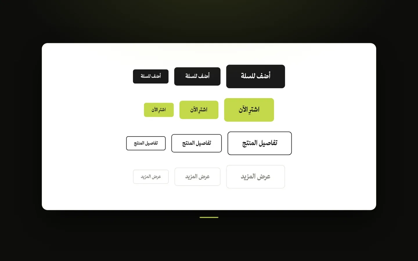
- Primary Button Appearance - Solid (default) fills the button with the button color and a readable label. Outline makes the button transparent, with a border and label in the button color. Soft tint gives it a light, see-through tint of the button color with the label in that color and no border, and the tint deepens slightly on hover.
- Background Color - the button color. With Solid, it’s the fill color, and it’s also used for the Add to Cart, Notify Me and Checkout buttons. With Outline and Soft tint, it colors the border, label and tint. Leave it empty to follow Button Color Source.
- Text Color - the label color on Solid primary buttons. Leave it empty to have a readable color chosen automatically.
- Border Color - the border color of primary buttons, with any appearance. Leave it empty to match the button color.
- Hover Background Color - the button’s background while a visitor points at it. If left empty, the button keeps its Background Color when one is set, and otherwise follows Button Color Source.
- Hover Text Color - the label color while a visitor points at the button. Leave it empty to keep Text Color.
Buttons - Secondary Button
Softer buttons with a light background, used wherever a section’s button style is set to Secondary.
- Background Color - the fill color of secondary buttons. Leave it empty to use Section / Surface Background from Layout → Colors.
- Text Color - the label color. Leave it empty to use the main button color (your brand color with Store Brand Color, otherwise Primary / Button Color).
- Hover Background Color - the background while a visitor points at the button. If left empty, it keeps Background Color, or uses Surface Hover Color from Layout → Colors when Background Color is empty too.
- Hover Text Color - the label color while a visitor points at the button. Leave it empty to keep Text Color.
Buttons - Outline Button
Buttons with a border and usually no fill, used for example for View Cart in the cart drawer, the page numbers, and wherever a section’s button style is set to Outline.
- Outline Button Fill - Transparent (default) shows only the border. Soft tint adds a light tint of the label color, a little stronger on hover. Solid fill fills the button with Fill Color, or with Border Color when Fill Color is empty, and picks black or white for the label automatically. With Solid fill and neither color set, the button is filled with the page’s primary text color and the label uses the page background color.
- Fill Color - the color inside outline buttons, mainly for Solid fill. Note that entering a color here fills outline buttons whichever fill option is chosen.
- Border Color - the border color. Leave it empty to use Primary Borders from Layout → Colors.
- Text Color - the label color. Leave it empty to use Primary Text from Layout → Colors, or the automatic readable color with Solid fill.
- Hover Background Color - the background while a visitor points at the button. Leave it empty to keep the normal fill.
- Hover Text Color - the label color while a visitor points at the button. Leave it empty to keep Text Color.
- Hover Border Color - the border color while a visitor points at the button. Leave it empty to keep Border Color.
Buttons - Appearance by Button Role
Give specific store buttons their own look, whatever their usual style. Each can be set to Theme default (keeps the theme’s design), Solid (filled with the button color and a readable label), Outline (transparent with a border and label in the button color, filling in on hover), or Soft tint (a light tint of the button color with the label in that color, deepening on hover). The button color is the primary button’s Background Color when Primary Button Appearance is Solid, and otherwise the color from Button Color Source.
- Add to Cart / Notify Me - the Add to Cart buttons and the Notify Me button on product pages. On product cards, the Button Style chosen under Product Card → Add to Cart Button takes priority when it isn’t left on Theme Buttons (inherit).
- Buy Now - the Buy Now button on product pages.
- Checkout / View Cart - the Checkout button in the cart drawer and on the cart page, and the View Cart button in the cart drawer.
- Pagination - the page-number buttons below long lists, such as on the questions page. On category pages the page numbers keep their own design, so this option may show little or no change there.