

Hero Section (New Version)
On this page 12
A large banner for the top of your homepage that shows one or more banners, each with an image or a video and, optionally, a title, description, statistics, and up to two buttons. It comes in three looks - Two Columns, Overlay Card, and Cinematic Slideshow - and adding more than one banner turns it into a slider that visitors can swipe through.
Layout & Style
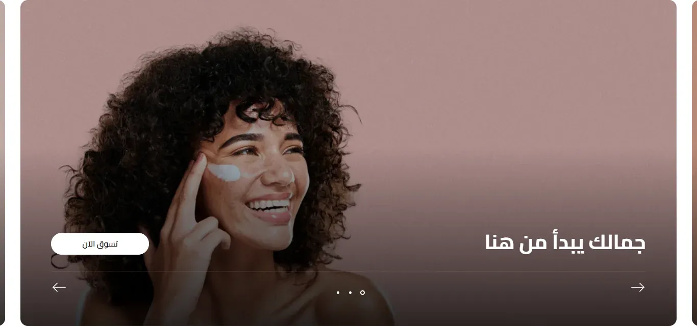
- Style - the overall look of the section. Two Columns places the image on one side and the text on the other. Overlay Card shows each banner as a card with the text laid over the image, and when you have more than one banner the edges of the neighboring cards peek in from the sides. Cinematic Slideshow shows large, wide slides with the text and buttons on top of the image and a soft fade to keep them readable. Each style has its own options group below, and only the group for the chosen style is shown.
Two Columns Options
These options only appear, and only take effect, when Style is set to Two Columns.
- Image Side - whether the image sits on the Left or the Right on larger screens, with the text on the other side. On smaller screens the image and text stack instead.
- Full Width - when on, the section stretches edge to edge across the browser window, with the image and the text area touching. When off, it stays within the normal page width with space between the image and the text.
- Image Ratio (Mobile) - the shape of the image on phones and smaller screens: 4:3, Square 1:1, Portrait 3:4, or Wide 16:9. On larger screens the image stretches to fill the section’s height instead.
- Spacing (Desktop) - the empty space above and below the section on larger screens. When Full Width is on, this space is added around the text instead.
- Spacing (Mobile) - the same spacing, for phones and smaller screens.
Banners set to Image Only (Clickable) or Video have no text, so in this style their image or video fills the whole width.
Overlay Card Options
These options only appear, and only take effect, when Style is set to Overlay Card. On phones, the text of each banner sits below (or above) the image rather than on top of it.
- Full Width - when on (the default), the row of cards stretches edge to edge across the browser window. When off, it stays within the normal page width.
- Card Width (Desktop) - how much of the available width each card takes on larger screens, as a percentage. Lower values leave more room for the neighboring cards to peek in at the sides. Only matters when you have more than one banner.
- Card Width (Mobile) - the same card width, for phones.
- Image Ratio (Desktop) - the shape of each card on larger screens. Match Image Size lets the card follow the image’s own proportions. Fixed Height uses the Min Height (Desktop) value from Shared Settings. The other choices, from Ultra Wide 4:1 down to Square 1:1, give every card that exact shape and crop the image to fit.
- Image Ratio (Mobile) - the shape of the image on phones: Match Image Size, Fixed Height (uses Image Height (Mobile) below), or a fixed shape from Wide 16:9 to Portrait 9:16.
- Image Height (Mobile) - the height of the image on phones, in pixels. Used when Image Ratio (Mobile) is set to Fixed Height, and always for Video banners.
- Gap Between Cards - the space between neighboring cards. Only matters when you have more than one banner.
- Card Background - the fill color of the cards on larger screens. It shows behind the image, for example around images with transparent areas, or below the image when the text is taller than the picture. A banner’s own Background color takes priority over it.
- Image Overlay Color - the color of a see-through layer placed over the image to help the text stand out.
- Image Overlay Strength - how strong that layer is. At 0 (the default) there is no layer. The layer only appears on larger screens and only on Image With Content banners.
Cinematic Slideshow Options
These options only appear, and only take effect, when Style is set to Cinematic Slideshow. In this style the section always spans the full browser width, and the text and buttons sit on top of the image on every screen size.
- Full Width - when on, each slide fills the entire screen width. When off, slides keep to the normal page width and the edges of the previous and next slides peek in at the sides.
- Slide Gap - the space between slides, in pixels. Most noticeable when Full Width is off.
- Match Image Size (Desktop) - on by default. When on, image slides on larger screens take the height of the image itself, so the whole image shows without cropping. When off, every slide uses the Min Height (Desktop) value from Shared Settings and the image is cropped to fill it. Video banners always use Min Height (Desktop).
- Height (Mobile) - the height of the slides on phones, in pixels. On larger screens the height follows Match Image Size (Desktop) above.
- Text Color Over Image - the color of the text on the slides, and of the slider dots and arrows. Title Color and Subtitle Color can still override it for those items, and the statistics use their own colors.
- Gradient Color - the color of the fade laid over the image to keep the text readable. The fade is lighter at the top and gets stronger toward the bottom.
- Gradient Strength - how strong that fade is. At 0 there is no fade. It only appears on Image With Content banners.
- Image Zoom Entrance - when on, each slide’s image or video starts slightly enlarged and smoothly settles into place as the slide comes into view.
Shared Settings
These settings are shown for every style, but not every style uses all of them - each description says where it applies.
- Mobile Order - on smaller screens, where the image and text stack, whether the image or the text comes first: Image First or Content First. Applies to Two Columns and Overlay Card.
- Content Width - how the width is split between the image and the text on larger screens: Equal, Wider Image, or Wider Content. In Two Columns it sets the widths of the image and text columns; in Overlay Card it sets how wide the text area over the card is. Not used by Cinematic Slideshow.
- Min Height (Desktop) - a height in pixels for larger screens. In Two Columns it is the minimum height of the image. In Overlay Card it is the card height when Image Ratio (Desktop) is Fixed Height, and for Video banners. In Cinematic Slideshow it is the height of the slides when Match Image Size (Desktop) is off, and for Video banners.
- Corners - how rounded the corners of the image or card are, in pixels, from sharp at 0 to fully rounded. Applies to all styles.
Slider
These settings only matter when you add more than one banner, which turns the section into a slider. In the Overlay Card and Cinematic Slideshow styles the slider loops continuously; in Two Columns it stops at the first and last banner.
- Navigation - how visitors move between banners: Dots, Arrows, Dots & Arrows, Scrollbar, or None. Visitors can always swipe or drag, even with None.
- Autoplay - when on, the slider moves to the next banner automatically.
- Duration (Seconds) - how many seconds each banner stays on screen before moving to the next one. Only shown when Autoplay is on.
Banners
Each item in the list is one banner. The text, position, button, and statistics fields only appear for Image With Content banners, and a few fields only appear for the Overlay Card style, as noted.
- Banner Type - Image Only (Clickable) shows just the picture and makes the whole banner a link. Image With Content shows the picture together with your text, statistics, and buttons. Video shows a video that plays silently on repeat.
- Image - the banner picture. For Video banners with an uploaded file, it is shown as a preview before the video starts.
- Mobile Image - an optional separate picture shown on phones instead of Image.
- Alt Text - a short description of the image for visitors using screen readers and for search engines. If left empty, the banner’s title (or your store name) is used.
- Banner Link - the web address the banner opens when clicked. Only for Image Only (Clickable) banners.
- Video Source - whether the video comes from an uploaded file (Upload File) or a YouTube Link. Only for Video banners.
- Video File - the uploaded video. It plays automatically, muted and on repeat, with no controls.
- Video URL - a YouTube link to use as the banner video. It also plays automatically, muted and on repeat.
- Eyebrow - a short line of text shown just above the title, such as a small tagline. Leave it empty to hide it.
- Title - the banner’s main heading.
- Subtitle - supporting text shown below the title. Line breaks you type are kept.
- Content Side - where the text sits across the card on larger screens: Start, Center, or End. Only for the Overlay Card style.
- Vertical Position - whether the text sits at the Top, Middle, or Bottom of the banner.
- Text Alignment - aligns the text, statistics, and buttons to the Start, Center, or End.
- Background - a card fill color for this banner only, used instead of Card Background. Only for the Overlay Card style.
- Text Color - a text color for this banner only, used on larger screens. Only for the Overlay Card style.
- Button 1 Text - the label on the first button. Leave it empty to hide the button.
- Button 1 Link - the web address the first button opens.
- Button 2 Text - the label on an optional second button, shown next to the first. Leave it empty to hide it.
- Button 2 Link - the web address the second button opens.
- Stat 1 Value / Stat 1 Label - a highlight number (such as “10K+”) and a short caption shown under it (such as “Happy customers”). Leave both empty to hide this statistic.
- Stat 2 Value / Stat 2 Label - a second statistic, in the same way.
- Stat 3 Value / Stat 3 Label - a third statistic.
- Stat 4 Value / Stat 4 Label - a fourth statistic. Statistics only show when Show Statistics is on.
Text Styles
These apply to the text on every banner.
- Title Size - how large the banner titles appear: Small, Medium, Large, or Extra Large. The size adjusts automatically to the screen width.
- Title Weight - how bold the titles appear: Regular, Medium, Semibold, or Bold.
- Title Color - a custom color for the titles. Leave it empty to use the section’s text color.
- Subtitle Size - how large the subtitles appear: Small, Medium, or Large.
- Subtitle Weight - how bold the subtitles appear: Light, Regular, or Medium.
- Subtitle Color - a custom color for the subtitles. Leave it empty to use the section’s text color, shown slightly faded.
Content Animation
How the eyebrow, title, subtitle, statistics, and buttons animate in each time a banner comes into view. Visitors who have turned off animations on their device see the content without motion.
- Effect - the type of motion: None, Fade, Rise Up, Drop Down, Slide In, Zoom In, or Word by Word (the title’s words appear one after another while the other items rise up).
- Duration (ms) - how long each item’s animation takes, in milliseconds (1000 ms is one second).
- Stagger (ms) - the pause before each next item starts animating, so the items appear one after another instead of all at once.
- Start Delay (ms) - how long to wait before the first item starts animating.
Buttons
These apply to the buttons on every banner.
- Button 1 Style - the first button’s look: Theme Default, Primary, Secondary, Outline, Ghost (transparent), or White. Theme Default shows it as a Primary button.
- Button 1 Size - how large the first button is: Theme Default, Compact (slightly smaller), or Large (slightly larger).
- Button 1 Weight - how bold the first button’s label is: Theme Default, Regular, Medium, Semibold, or Bold.
- Button 1 Corners - the first button’s corner style: Theme Default, Sharp, Small, Medium, Large, or Pill (fully rounded).
- Button 2 Style - the second button’s look, with the same choices. Theme Default shows it as an Outline button.
- Button 2 Size - how large the second button is, with the same choices as Button 1 Size.
- Button 2 Weight - how bold the second button’s label is, with the same choices as Button 1 Weight.
- Button 2 Corners - the second button’s corner style, with the same choices as Button 1 Corners.
Statistics
- Show Statistics - when on, the statistics you enter in each banner are shown. Turn it off to hide them on all banners.
- Style - how the statistics are presented: Plain, With Dividers (thin lines between them), or Boxed (each inside its own small card). Only shown when Show Statistics is on, like the settings below.
- Value Size - how large the numbers appear: Small, Medium, or Large.
- Value Color - the color of the numbers. Leave it empty to use Accent (Statistics) from Colors.
- Label Color - the color of the captions under the numbers. Leave it empty to use the theme’s soft gray text color.
Colors
- Section Background - the background color behind the whole section. Leave it empty to keep the default.
- Text Color - the main color of the banner text. In the Cinematic Slideshow style, Text Color Over Image is used instead.
- Accent (Statistics) - the color of the statistic numbers when Value Color is empty. Leave it empty to use the theme’s accent color.