

Categories Showcase
On this page 11
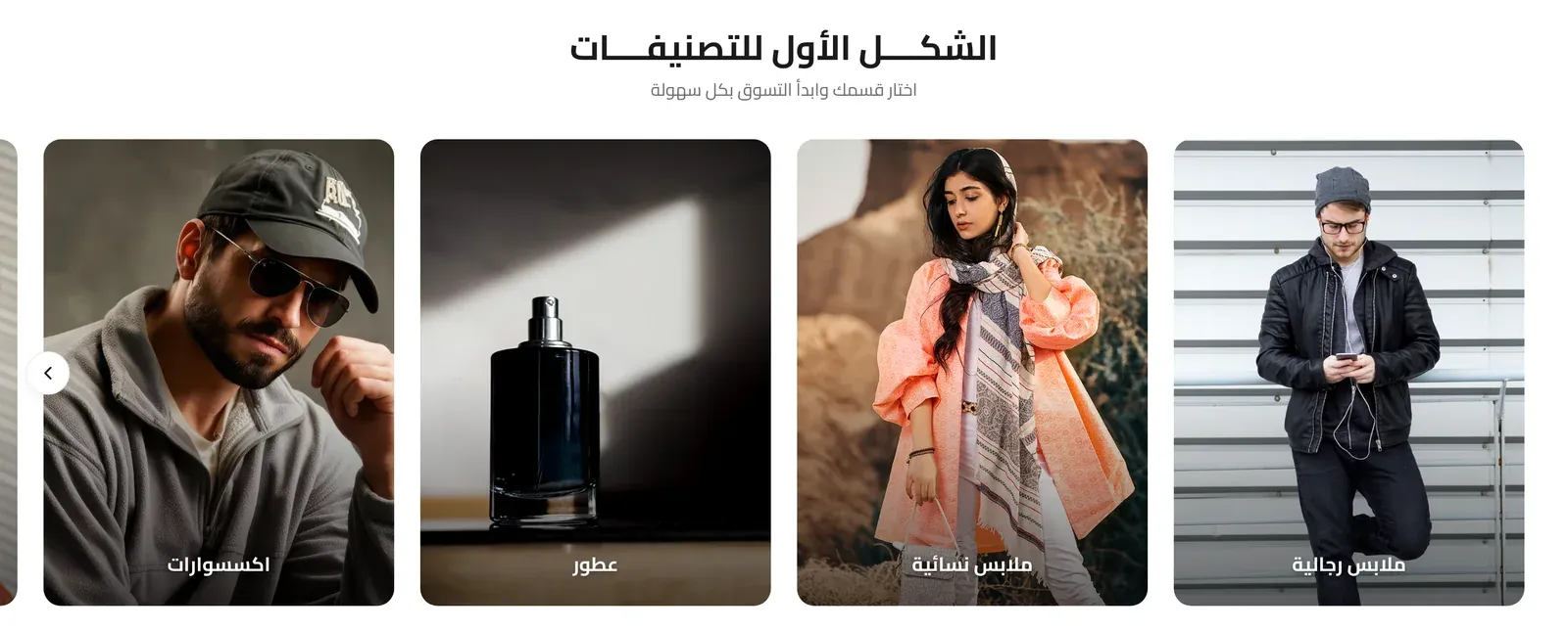
A visual showcase of your product categories, letting visitors jump straight into browsing a category. Supports several distinct visual layouts, from clean grid cards to a circular badge layout.
Section Header
- Section Title - the main heading for the section.
- Section Subtitle - supporting text shown near the title.
- Title Font Weight - how bold the title text appears, from Light to Extrabold.
- Subtitle Font Weight - how bold the subtitle text appears, from Light to Extrabold.
- Title Color - the color of the title text.
- Subtitle Color - the color of the subtitle text.
- Header Style - whether the heading sits centered above the categories, or splits to sit side by side with the “view more” button.
- Heading Alignment - aligns the heading text to the left, center, or right.
- Title Pre Decoration - a small decorative touch before the title: none, a short bar, an underline, or a spark.
- Subtitle Pre Decoration - a small decorative touch before the subtitle: none, a soft line, or a spark.
- Eyebrow (above title) - a short line of text shown just above the section title, handy for a small tagline such as “New Arrivals”. Leave it empty to hide it.
- Eyebrow Style - how the eyebrow looks: Plain text, With Line (a short line before the text), or Pill (the text inside a small rounded badge).
- Eyebrow Font Weight - how bold the eyebrow text appears, from Light to Extrabold.
- Eyebrow Color - the color of the eyebrow text. If left empty, the theme’s accent color is used.
- Badge Background Color - the fill color behind the eyebrow text. Only shows when Eyebrow Style is set to Pill.
View More Button
- Show “View More” Button - when on, adds a button linking elsewhere (e.g. a full categories page).
- “View More” URL - the web address the button opens.
- View More Button Text - the label on the button.
- View More Link Position - whether the button sits aligned with the section title, or below the categories.
Button
- Button Style - the “view more” button’s look: the theme’s default, a solid Primary or Secondary color, an Outline, a transparent Ghost, White, or a plain Text Link.
- Button Size - how large the button appears.
- Button Font Weight - how bold the button’s label text appears.
- Button Shape - the button’s corner style, from sharp corners to a fully rounded pill shape.
Layout & Columns
- Layout Style - the overall visual treatment of the categories: Clean Grid Cards, a Full-Bleed Grid with no gaps, a Minimal List with a small image accent, a Masonry Image Collage with varying tile sizes, a Circular Layout of round badges, an Oval shape layout, Editorial Landscape wide cards with overlaid text, or Name Badges (small rounded badges showing each category’s name, with its icon if it has one).
- Category Name Position - whether the category name sits Over the image or Below the image. Only applies to the Clean Grid Cards layout.
- Display Type - whether categories are shown in a fixed Grid, or as a horizontally scrollable Slider.
- Card size follows the image - when on, each card keeps the natural shape of its category image (or the custom image) instead of cropping it to a fixed shape. Applies to the Clean Grid Cards, Full-Bleed Grid, Masonry Image Collage and Editorial Landscape layouts.
- Grid Columns (Mobile / Tablet / Desktop) - how many categories sit side by side at each screen size. Not used by the Name Badges layout, where badges simply line up one after another.
- Autoplay - when Display Type is Slider, automatically advances the slider without visitor interaction.
- Slide Speed (Seconds) - how many seconds between automatic slide advances. Only used when Autoplay is on.
- Navigation Style - when Display Type is Slider, how visitors navigate manually: Arrows, Dots, or a draggable Scrollbar.
Category Icon (from custom fields)
- Show category icon above the name - when on, displays a small icon above each category’s name, pulled from the category’s custom fields (or a custom icon you set per category below).
- Icon Size - the size of that icon, in pixels.
Name Badges
Only relevant when Layout Style is “Name Badges”.
- Badge Size - how large each badge appears, including its text and inner spacing: Small, Medium, or Large.
- Icon Size Inside the Badge - the size of the category icon inside each badge, in pixels. The icon only shows when “Show category icon above the name” is on and the category has an icon.
Overlay Text Colors (Editorial Landscape)
Only relevant when Layout Style is “Editorial Landscape”.
- Category Name Color - the color of the category name text overlaid on the image.
- “Discover” Link Color - the color of the small “discover” link/prompt shown with each category.
Circular Layout
Only relevant when Layout Style is “Circular Layout”.
- Show border around the category - when on, adds a ring/border around each circular category badge.
Categories List
Each entry in this list is one category card shown in the section.
- Select Category - which of your store’s categories this card represents.
- Custom Name (Optional) - overrides the category’s own name with different text, if you want the card to show something else.
- Custom Image (Optional) - overrides the category’s own image with a different picture for this card.
- Custom Icon (Optional) - overrides the automatic category icon with a custom one for this card.
- Subtitle (Optional) - a short supporting line shown on the card below the category name.
Empty State Title / Empty State Subtitle
The heading and supporting text shown instead of the section when no categories have been added yet.
Overlap Previous Section
- Pull section over the previous one - when on, this section overlaps and rises slightly on top of whatever section comes before it, creating a layered effect.
- Overlap Amount (Desktop) - how far the section rises over the previous one on desktop screens, in pixels. Only used when overlap is on.
- Overlap Amount (Mobile) - the same overlap distance, but for phone screens.