

Today Offer
On this page 21
- Layout Style
- Section Size
- Content Bg Color (Split Layout)
- Media Type
- Custom Image (Used as fallback)
- Video Source / Video file / Video URL
- Link Type
- Select Product / Select Category
- Show Remaining Stock Progress Bar
- Total Stock (for calculation)
- Show product/category name in card / Show product price in card
- Section Header
- Description / Description Weight
- Discount Text (e.g. 50%)
- Offer Label (Next to discount)
- Timer End Date (YYYY-MM-DD HH:MM:SS)
- Stock Label / Stock Badge
- Button
- Add to Cart Button
- Product Price (Content Area)
- Colors
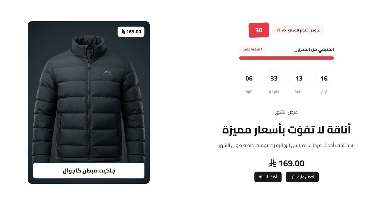
A split promotional section pairing an image or video with a countdown timer, discount badge, and stock indicator - built for a limited-time “deal of the day” style offer.
Layout Style
Whether the text sits on the right with the media on the left (Text Right, Media Left), or the reverse (Text Left, Media Right).
Section Size
How tall the section appears overall: Small, Medium, or Large. In the current version of the theme this choice has no visible effect.
Content Bg Color (Split Layout)
The background color behind the text side of the split layout.
Media Type
Whether the visual side shows an Image or a Video.
Custom Image (Used as fallback)
A picture to show, used when Media Type is Image (or as a fallback if a linked product has no image).
Video Source / Video file / Video URL
Whether the video comes from an uploaded file or a YouTube link, and the matching file or link. Used when Media Type is Video. Note: in the current version of the theme the visual side always shows an image (the linked product’s or category’s image, or the Custom Image), so choosing Video doesn’t display a video.
Link Type
What the offer links to: None (a Custom Link elsewhere on the card), a specific Product, or a Category.
Select Product / Select Category
The product or category this offer promotes, matching the Link Type chosen.
Show Remaining Stock Progress Bar
Only relevant when linking to a Product. Displays a bar showing how much stock is left, to create urgency.
Total Stock (for calculation)
The total stock number used to calculate how full the progress bar appears. Only used when the stock bar is on.
Show product/category name in card / Show product price in card
Toggles the linked product’s or category’s name and price on the card.
Section Header
- Main Title / Subtitle - the section’s heading and supporting text.
- Title Font Weight / Subtitle Font Weight - how bold each appears.
- Header Style - centered above the offer, or split to sit side by side.
- Heading Alignment - left, center, or right.
- Title Pre Decoration / Subtitle Pre Decoration - a small decorative touch before each.
- Eyebrow (above title) / Eyebrow Style / Eyebrow Font Weight / Eyebrow Color / Badge Background Color - these eyebrow options appear in this group, but this section’s current design doesn’t display an eyebrow line, so changing them has no visible effect.
Description / Description Weight
A paragraph of supporting text describing the offer, and how bold it appears.
Discount Text (e.g. 50%)
The discount value shown prominently (e.g. “50%”).
Offer Label (Next to discount)
A short label shown beside the discount badge (e.g. “Today’s Deals 🔥”).
Timer End Date (YYYY-MM-DD HH:MM:SS)
The exact date and time the countdown timer counts down to.
Stock Label / Stock Badge
The caption above the stock bar (e.g. “Remaining Stock”), and a short urgency badge (e.g. “Only 5 left”).
Button
- Button Text / Button Link - the label and destination of the offer’s button.
- Button Style / Button Size / Button Font Weight / Button Shape - the button’s look, size, boldness, and corner style.
Add to Cart Button
Only appears when Link Type is Product, a product is selected, and that product is in stock. If the product needs choices first (such as size or color), clicking the button opens a quick view so the shopper can pick them.
- Show Add to Cart Button - turns the add to cart button on or off.
- Button Text (leave empty for default) - the label on the button. Leave it empty to use the standard “Add to Cart” wording.
- Button Style / Button Size / Button Font Weight / Button Shape - the button’s look, size, boldness, and corner style.
Product Price (Content Area)
The linked product’s price, shown just above the buttons alongside the offer text. Only appears when Link Type is Product and a product is selected.
- Show Product Price - turns this price on or off.
- Current Price Color - the color of the price the shopper pays (the sale price when the product is discounted). If left empty, the theme’s default text color is used.
- Compare-at Price Color - the color of the original, crossed-out price, which only shows when the product has a sale price. If left empty, a softer muted text color is used.
Colors
Color controls for each part of the offer:
- Main Title Color - the color of the section’s main title.
- Subtitle Color - the color of the subtitle.
- Description Color - the color of the description paragraph.
- Offer Label Bg / Offer Label Text - the background and text colors of the offer label beside the discount badge.
- Discount Badge Bg / Discount Badge Text - the background and text colors of the discount badge.
- Stock Label Color - the color of the stock caption.
- Stock Badge Bg / Stock Badge Text - the background and text colors of the stock urgency badge.
- Stock Bar Color - the fill color of the remaining stock progress bar.
- Timer Box Bg / Timer Text Color - meant for the countdown timer’s box background and numbers, but in the current version of the theme they have no visible effect - the timer keeps its default look.
- Product Name in Card / Product Price in Card - meant for the name and price shown on the image card, but in the current version of the theme they have no visible effect - both keep the theme’s default text colors.