

Video
On this page 15
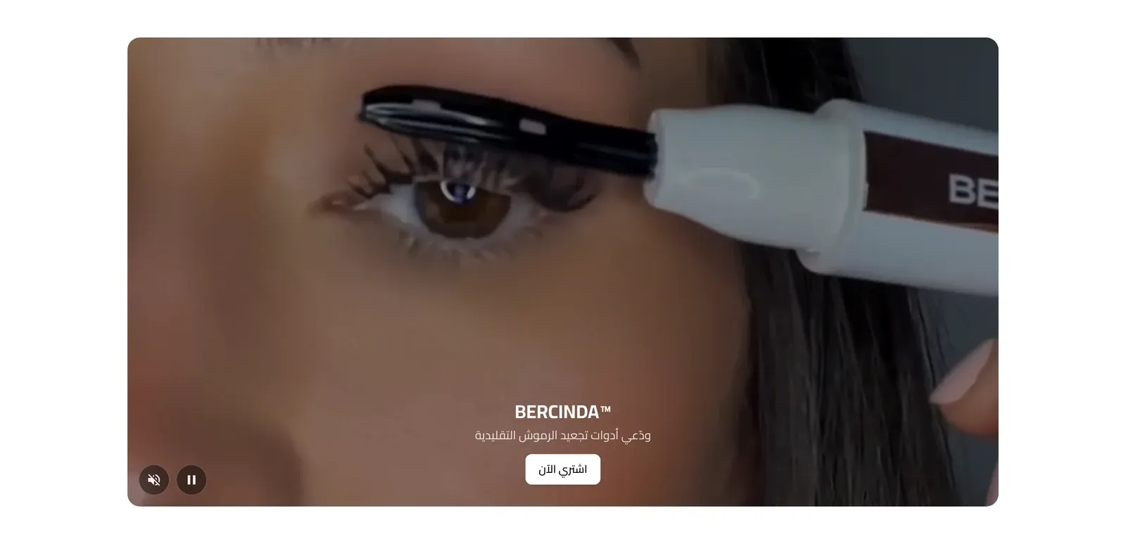
A flexible video showcase supporting uploaded files, direct video links, or YouTube - shown as a single hero video, a grid, a horizontal slider, or a vertical feed, each video with its own optional title, description, and button.
Enable Section
Turns the whole section on or off without deleting its settings.
Section Header
- Section Title / Section Description - the heading and supporting text for the section.
- Title Font Weight / Subtitle Font Weight - how bold each appears.
- Header Style - centered above the videos, or split to sit side by side.
- Heading Alignment - start, center, or end.
- Eyebrow (above title) - a short line of text shown just above the section title, handy for a small tagline such as “New Arrivals”. Leave it empty to hide it.
- Eyebrow Style - how the eyebrow looks: Plain text, With Line (a short line before the text), or Pill (the text inside a small rounded badge).
- Eyebrow Font Weight - how bold the eyebrow text appears, from Light to Extrabold.
- Eyebrow Color - the color of the eyebrow text. If left empty, the theme’s accent color is used.
- Badge Background Color - the fill color behind the eyebrow text. Only shows when Eyebrow Style is set to Pill.
- Main Title Color (optional) - a custom color for the section title. Leave it empty to keep the default color.
- Subtitle Color (optional) - a custom color for the subtitle. Leave it empty to keep the default color.
General
- Layout - Smart: 1 video → full width, 2–4 → grid, 5+ → slider - Smart (recommended, adapts automatically to how many videos you add), Grid, Horizontal Slider, Vertical Feed, or Featured + List.
- Container Width - Boxed (contained within the normal page width) or Full Width.
- Full Screen Height (100vh) - single video - when on and there’s a single video, it fills the entire screen height.
Columns (Grid layout)
How many videos sit side by side in the Grid layout.
- Desktop Columns / Tablet Columns / Mobile Columns - the number of columns on desktop, tablet, and mobile screens. The tablet and mobile values also cap how many videos show at once in the Horizontal Slider on those screens, and Mobile Columns also applies to the Featured + List layout on phones.
Video Display
- Card Style - Rounded, Square (sharp corners), Minimal, Border, or Glass (a frosted-glass effect).
- Aspect Ratio - Auto, 16:9, 4:3, 1:1, or 9:16.
- Video Height (Hero / Vertical Feed, or Auto aspect ratio) - Small, Medium, Large, or a Custom height, used for the Hero/Vertical layouts or when Aspect Ratio is Auto.
- Custom Height (px) - the exact height, only used when Video Height is Custom.
- Gap Between Videos - the spacing between videos.
Fit to Screen Height
Keeps videos from growing taller than the visitor’s screen, so a video can be seen in full without scrolling.
- Never exceed the screen height (video stays fully visible without scrolling) - when on, each video is limited to the heights below and centered, keeping its shape. When off (the default), videos are sized only by the Aspect Ratio and Video Height settings.
- Max Height on Desktop (% of screen height) - the tallest a video can be on computer screens, as a percentage of the screen’s height (from 40% to 100%).
- Max Height on Mobile (% of screen height) - the same limit, but for phone screens.
Playback
- Autoplay When Visible - starts playing automatically once a video scrolls into view.
- Mute (required for autoplay to work) - most browsers block autoplay with sound, so this should stay on if Autoplay is used.
- Loop - restarts automatically when it finishes.
- Show Controls - displays play/pause and volume controls.
- Inline Playback - plays within the page layout rather than expanding to full-screen on mobile.
- Lazy Load - only loads a video once it’s about to be visible, speeding up the page.
- Preload - how much of the video loads ahead of time: None, just its Metadata, or Auto (as much as the browser decides).
- Play Inside Card (when off, videos open in a popup) - whether videos play directly in their card, or open in a popup window when clicked.
- Open in Popup (Lightbox) - forces videos to always open in a popup overlay instead of playing inline.
Slider (Slider layout only)
- Slides Per View - how many videos are visible at once.
- Space Between Slides - the gap between them.
- Navigation Arrows / Pagination Dots - toggle manual navigation controls.
- Infinite Loop - lets the slider wrap around continuously instead of stopping at the last video.
- Autoplay / Autoplay Speed (ms) / Pause on Hover - whether the slider advances on its own, how fast, and whether it pauses when a visitor points at it.
- Mouse Drag / Touch Swipe - lets visitors drag with a mouse or swipe on touch devices to change slides.
- Center Mode - keeps the active slide centered rather than aligned to one edge.
- Variable Width - allows slides to have different widths instead of a uniform size.
Content
- Text Alignment - start, center, or end.
- Show Title / Show Subtitle / Show Description / Show Button - individually toggle each piece of text/button on every video card.
Button
- Button Style / Button Size / Button Font Weight / Button Shape - the look, size, boldness, and corner style of each video’s button.
Overlay
- Overlay Style (behind card text - can be overridden per video) - None, Dark, Gradient, or your store’s Brand Color, shown behind the text on top of each video.
- Overlay Opacity - how strong that overlay appears.
Animation
Card Entrance Animation - how video cards animate into view: None, Fade, Slide Up, Zoom, or Scale.
Mobile
- Mobile Card Height - Auto (follows the aspect ratio), Small, Medium, or Large.
- Hide Description on Mobile / Hide Subtitle on Mobile - trims text on phone screens to save space.
Spacing
Top Padding / Bottom Padding - the empty space above and below the section.
Videos
Each entry in this list is one video.
- Enable Video - turns this specific video on or off.
- Sort Order (lower shows first) - controls display order independent of the list order.
- Source Type - an Uploaded Video, an External Video URL, or YouTube.
- Upload Video / Video URL (direct mp4/webm) / YouTube URL - full, short (youtu.be) or embed links - the actual video, matching the Source Type chosen. A YouTube link can be the full address, a short youtu.be link, or an embed link.
- Poster Image (optional - uploaded / URL video) / Poster Image (optional) / Custom Thumbnail (optional) - a cover image shown before the video plays, matching the source type. For YouTube videos, if no custom thumbnail is set, the video’s own YouTube thumbnail is used.
- Start Time (seconds) / End Time (seconds, 0 = until the end) - trims a YouTube video to a specific range.
- Autoplay for This Video - Follow Section Setting uses the section’s Autoplay When Visible setting; Autoplay or No Autoplay overrides it for this one video specifically.
- Title / Subtitle / Description - the text shown with this video.
- Enable Button / Button Text / Button Link / Open in New Tab - an optional button on this video and its destination.
- Link Video To - makes the whole video card link to No Link, a Product, or a Category.
- Select Product / Select Category - the destination, matching Link Video To.
- Override Overlay for This Video / Overlay Color / Overlay Opacity - replaces the section’s shared overlay style with a custom color and strength for this video only.