

Before & After
On this page 17
- Comparison Orientation
- Text Placement
- Image Aspect Ratio
- Comparison Size
- Custom Width (px)
- Initial Divider Position (%)
- Before Image / After Image
- Before Label / After Label
- Show Labels
- Eyebrow Text
- Section Header
- Text Alignment
- Button
- Handle Color
- Divider Line Color
- Label Background Color / Label Text Color
- Section Background Color
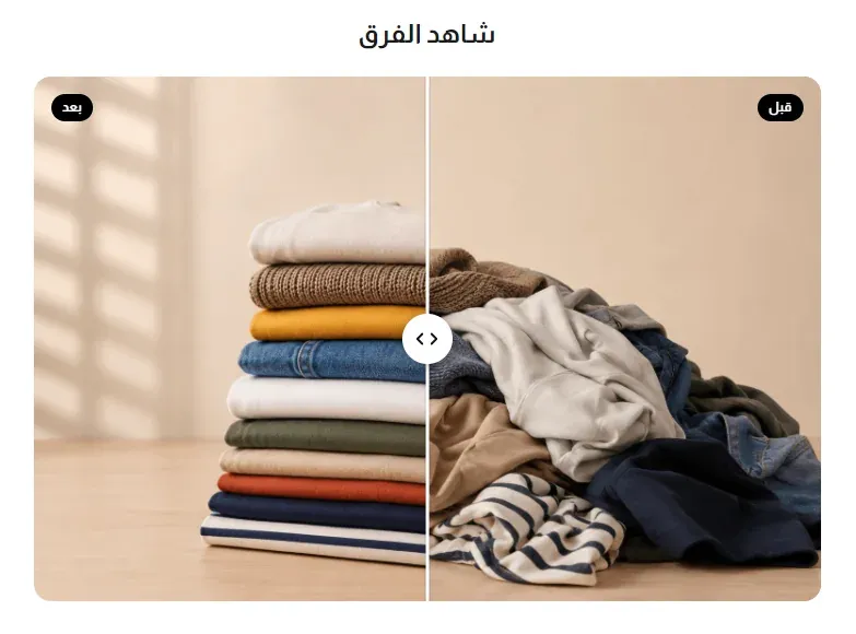
A two-image comparison with a draggable divider, letting visitors slide between a “before” photo and an “after” photo - ideal for showcasing a transformation, a renovation, a skincare result, or any before/after story.
Comparison Orientation
Whether visitors drag the divider left/right (Horizontal) or up/down (Vertical) to reveal more of the before or after image.
Text Placement
Where the section’s heading text sits relative to the comparison images: above them, below them, or beside them (with the text first or the images first).
Image Aspect Ratio
The shape the before/after images are cropped to: their original proportions, a landscape 16:9, a wide 3:2, a square 1:1, or a tall portrait 3:4.
Comparison Size
How wide the comparison widget appears: from Extra small (420px) up to Large (960px), Full section width, or a Custom width you set yourself with the setting below.
Custom Width (px)
The exact width of the comparison widget in pixels. Only used when Comparison Size is set to Custom.
Initial Divider Position (%)
Where the divider line starts when the page loads, as a percentage across the images - 50% starts it centered, showing half of each image.
Before Image / After Image
The two photos being compared - the starting state and the result.
Before Label / After Label
The small text labels shown on each side of the divider (e.g. “Before” and “After”). Only shown when Show Labels is on.
Show Labels
When on, displays the Before/After text labels over the images.
Eyebrow Text
A small line of text shown above the section heading - useful for a short tagline or category label.
Section Header
- Title - the main heading for the section.
- Subtitle - supporting text shown near the title.
- Title Font Weight - how bold the title text appears, from Light to Extrabold.
- Subtitle Font Weight - how bold the subtitle text appears, from Light to Extrabold.
- Main Title Color (optional) - a custom color for the section title. Leave it empty to keep the default color.
- Subtitle Color (optional) - a custom color for the subtitle. Leave it empty to keep the default color.
Text Alignment
Whether the heading text aligns to the start, the center, or the end of its line.
Button
- Button Text - the label on the section’s button. Leave empty to hide the button.
- Button Link - the web address the button opens when clicked.
- Button Position - whether the button sits right alongside the heading text, or on its own below the whole section.
- Button Style - the button’s look: the theme’s default, a solid Primary or Secondary color, an Outline, a transparent Ghost, White, or a plain Text Link.
- Button Size - how large the button appears.
- Button Font Weight - how bold the button’s label text appears.
- Button Shape - the button’s corner style, from sharp corners to a fully rounded pill shape.
Handle Color
The color of the draggable handle visitors grab to move the divider.
Divider Line Color
The color of the line that separates the before and after images.
Label Background Color / Label Text Color
The background and text color of the Before/After labels.
Section Background Color
The background color behind the whole section, visible in any empty space around the comparison widget.