

Call to Action (CTA)
On this page 7
A flexible promotional block combining a background (image, video, gradient, or solid color) with a heading and a button - for driving visitors toward a specific offer, page, or action. Can also split into a two- or three-panel layout.
Layout & Dimensions
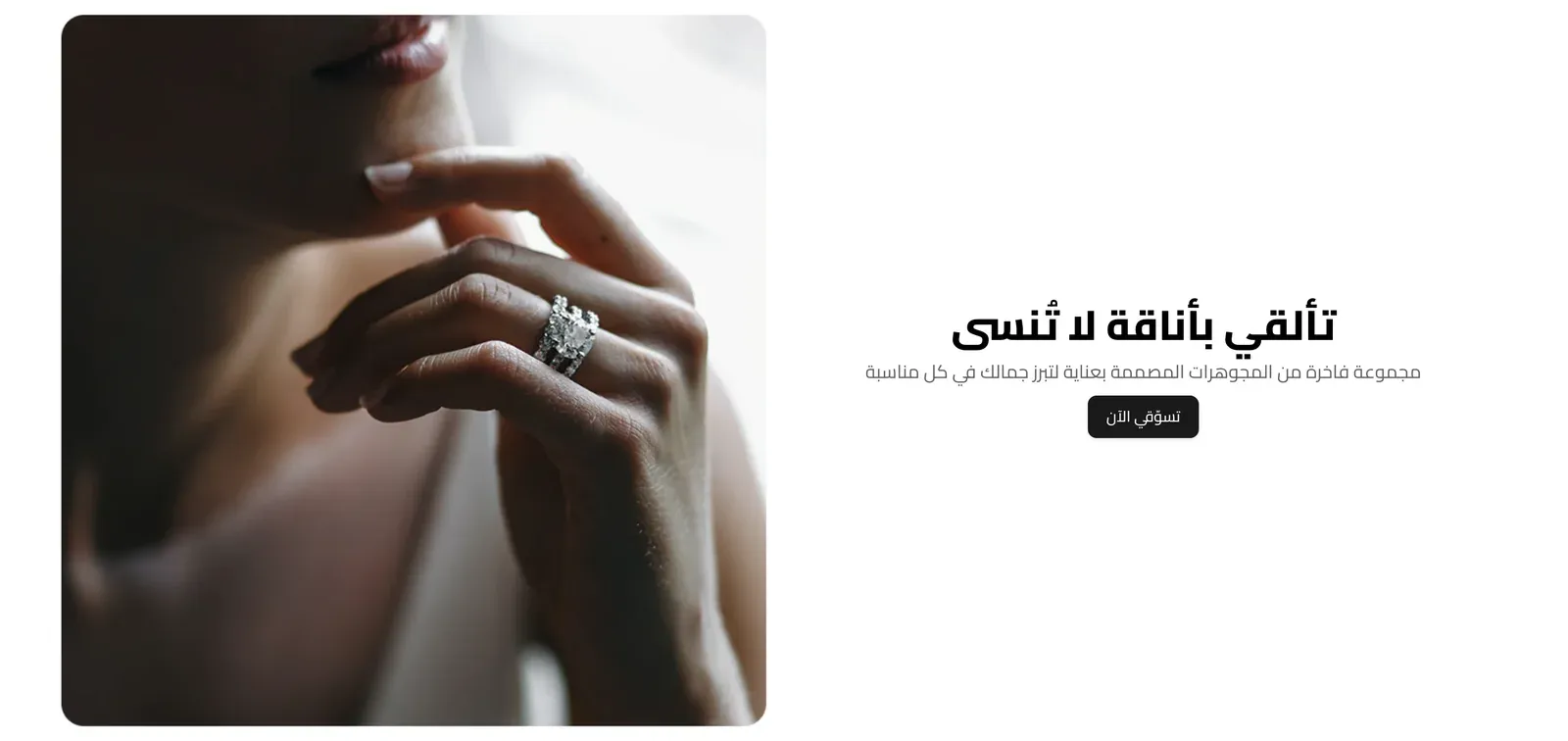
- Layout Style - One piece (a single full block), Two pieces (a media panel beside a content panel), or Three pieces (two side image panels with your main content in the middle).
- Full Width Section - when on, the section stretches edge-to-edge across the browser window.
- Section Corners (when not full width) - the corner style when the section isn’t full width: the theme’s default, Rounded, Sharp, or a Custom radius you set below.
- Corner Radius (px) - the exact roundness of the corners, in pixels. Only used when Section Corners is set to Custom.
- Section Aspect Ratio (Desktop) - the shape of the whole section on desktop screens: automatic (sized to fit the content), or a fixed ratio like a wide 16:9, a banner-like 3:1, 4:3, a square 1:1, or a tall 3:4.
- Section Aspect Ratio (Mobile) - the same choice for phone screens, set separately from desktop: automatic, a wide 16:9, 4:3, a square 1:1, or a tall 3:4 (the banner-like 3:1 isn’t offered on mobile).
- Content Position - where the heading/button content sits within the section: any of the nine positions from top-left to bottom-right.
- Content Width - how wide the content column can grow: Narrow, Normal, Wide, or Full.
- Media Position (Split Layout) - only for the Two pieces layout: whether the media panel sits on the left or the right, with content on the other side.
- Content Background Color (Split Layout) - only for the Two pieces layout: the background color behind the content panel.
Media Type
What fills the section’s background: an Image, a Video, a color Gradient, or a Solid Color.
- Image - the background picture (used when Media Type is Image).
- Image Link - a web address that opens when a visitor clicks the image.
- Video Source - whether the background video comes from an uploaded file or a YouTube link (used when Media Type is Video).
- Video file - the uploaded video file.
- Video URL - a YouTube link to use as the background video.
- Video Autoplay - when on, the video starts playing automatically.
- Muted - when on, the video plays with no sound by default.
- Loop - when on, the video restarts automatically after it finishes.
- Show Video Controls - when on, shows play/pause controls over the video.
- Video Controls Position - where those controls sit: bottom-left, bottom-right, or bottom-center. Only shown when Show Video Controls is on.
- Background Gradient - a color-blend background, used when Media Type is Gradient.
- Background Color - a plain background color, used when Media Type is Solid Color.
Overlay
- Enable Overlay - adds a semi-transparent layer on top of the background, which can help make text easier to read.
- Overlay Type - whether the overlay is a Solid Color or a Gradient.
- Overlay Color - the overlay’s color, when set to Solid Color.
- Overlay Gradient (CSS) - the overlay’s color blend, when set to Gradient.
- Overlay Opacity (%) - how strong the overlay appears, from fully transparent to fully solid.
Side Panels (Three-piece Layout)
Only relevant when Layout Style is “Three pieces”.
- Panels Min Height (px) - the minimum height of the two side panels.
- Side Images Darkness (%) - how much the side panel images are darkened, to help any text on them stay readable.
- Side Panels Title Color / Side Panels Text Color - the colors of the heading and body text on each side panel.
- First Panel Image / Title / Text / Link - the picture, heading, body text, and link for the left-hand (or first) side panel.
- Second Panel Image / Title / Text / Link - the same set of fields for the right-hand (or second) side panel.
Section Header
- Title - the main heading text.
- Subtitle - supporting text shown near the title.
- Title Font Weight - how bold the title text appears, from Light to Extrabold.
- Subtitle Font Weight - how bold the subtitle text appears, from Light to Extrabold.
- Eyebrow (above title) / Eyebrow Style / Eyebrow Font Weight / Eyebrow Color / Badge Background Color - these eyebrow options appear in this group, but this section’s current design doesn’t display an eyebrow line, so changing them has no visible effect.
Typography & Colors
- Font Size Mode - Default sizing, or Custom sizes you set with the sliders below.
- Title Font Size - Desktop / Tablet / Mobile (px) - the exact title text size at each screen width. Only used when Font Size Mode is Custom.
- Subtitle Font Size - Desktop / Tablet / Mobile (px) - the exact subtitle text size at each screen width. Only used when Font Size Mode is Custom.
- Title Color / Subtitle Color - the colors of the heading and supporting text.
Button
- Button Text - the label on the button. Leave empty to hide it.
- Button Link - the web address the button opens when clicked.
- Button Style - the button’s look: the theme’s default, a solid Primary or Secondary color, an Outline, a transparent Ghost, White, or a plain Text Link.
- Button Size - how large the button appears.
- Button Font Weight - how bold the button’s label text appears.
- Button Shape - the button’s corner style, from sharp corners to a fully rounded pill shape.