

General Settings & Custom Code
On this page 8
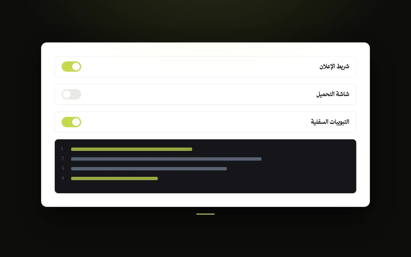
Store-wide options such as the back to top button, content protection, the browser tab icon, the loading screen, and a place to add your own code. You’ll find them in the theme customizer under Layout → General, Layout → Favicon, Layout → Preloader, and Layout → Custom Code (CSS / JS).
General
- Hide Loyalty (Rewards) Button - when the loyalty program is turned on in your Zid dashboard, the theme shows a floating Rewards button where shoppers can see how to redeem their points. Turn this on to hide that button. It has no effect if the loyalty program is off.
- Show Back to Top Button - shows a round button in the bottom corner of the screen (on the left in English, on the right in Arabic) once a visitor scrolls down a little. A ring around it fills up as they scroll, and tapping it brings them smoothly back to the top of the page. It moves up automatically to stay clear of other floating buttons and bottom bars.
- Back to Top Button Style - what appears inside the button: Up Arrow, or Progress Percentage (how far down the page the visitor is, such as 45%). Only shown when Show Back to Top Button is on.
- Protect Store Content - when on, visitors can’t right-click, select or copy text, drag images, or use the save-page shortcut, which makes it harder to copy your product photos and descriptions. Typing in search boxes and forms still works normally. This discourages casual copying but can’t fully stop a determined person.
- Don’t Open Cart on Add - normally the cart slides open from the side when a shopper adds a product. When this is on, only the item count on the cart icon updates and the shopper stays where they are.
- Hide Unavailable Products - hides the cards of out-of-stock products in product listings and in homepage sections.
- Enable Custom Scrollbar Style - gives the page scrollbar a slim, rounded look in a color of your choice.
- Scrollbar Color Source - Primary Color uses your store’s primary color; Custom Color uses the color you pick below. Only shown when Enable Custom Scrollbar Style is on.
- Custom Scrollbar Color - the scrollbar color. Only shown when Scrollbar Color Source is set to Custom Color. If left empty, the primary color is used.
Favicon
- Favicon - the small icon shown in the browser tab next to your page title, in bookmarks, and when a shopper adds your store to their phone’s home screen. A simple square image, such as your logo symbol, works best. If left empty, the theme doesn’t add an icon of its own.
Preloader
A full-screen loading screen with your logo that covers the page while it loads, then clears away to reveal your store, in a way that depends on the style you pick. It disappears shortly after the page finishes loading and never stays for more than a few seconds. Apart from Enable Preloader, these settings only appear once it is turned on.
- Enable Preloader - turns the loading screen on.
- Preloader Style - the look and animation of the loading screen. Default (Logo and Progress Line) shows your logo with a thin progress line below it, then fades away. Spinning Ring adds a thin ring spinning around the logo, and the logo grows slightly as the screen fades away. Logo Fill shows a faint copy of your logo that fills in with full color from one side as the page loads, with a percentage underneath. Split Curtain shows the logo with three bouncing dots, then the screen splits into two halves that slide up and down to reveal the store. Shine and Sweep passes a shine across the logo above a short moving line, then the whole screen sweeps upward with a curved edge. Editorial Counter places the logo in the corner and a large number counting up to 100 at the bottom, with the word Loading and a line that fills up, then the screen slides up. Expanding Dot shows a small dot under the logo that stretches into a short bar, then spreads to cover the screen in the accent color before fading away. Store Pattern fills the background with faint line icons that suit your type of store, drifting slowly around the logo above a short moving line.
- Store Type - the kind of icons that fill the background with the Store Pattern style: Fashion and Accessories, Perfume and Beauty, Electronics, Coffee and Sweets, Gifts and Flowers, or Sports. Only shown when Preloader Style is Store Pattern.
- Show Progress Line - shows a thin line below the logo with a bar that keeps sliding across it while the page loads. With Logo Fill, the line fills up along with the logo instead. It only applies to the Default and Logo Fill styles, since the other styles have their own loading animation.
- Enable Logo Pulse Animation - when on, the logo gently pulses while the page loads. When off, the logo simply fades in once.
- Logo Width (Large Screens) - how wide the logo appears on computers, from 50 to 300 pixels.
- Logo Width (Medium Screens) - the logo width on tablets and small laptops.
- Logo Width (Small Screens) - the logo width on phones.
- Preloader Logo (Light Mode) - the logo shown when your store is displayed in light mode. If left empty, Logo (Dark) from the Header settings is used, or otherwise your store logo. If there is no logo at all, your store name is shown instead.
- Preloader Logo (Dark Mode) - the logo shown when your store is displayed in dark mode (see Layout → Theme Mode). If left empty, Logo (White) from the Header settings is used, or otherwise your store logo.
- Use Store Colors - when on, the loading screen takes its background color and accent color from your store’s colors (Layout → Colors), following light and dark mode, and the four colors below are ignored.
- Background Color (Light Mode) - the loading screen’s background color in light mode.
- Progress Line Color (Light Mode) - the accent color of the loading animation in light mode: the moving bar on the progress line, and depending on the style, the ring, dots, counter, expanding dot or background icons.
- Background Color (Dark Mode) - the loading screen’s background color in dark mode.
- Progress Line Color (Dark Mode) - the same accent color for dark mode.
Custom Code (CSS / JS)
Lets you add extra code to your store, such as tracking pixels, chat widgets, or small design tweaks supplied by a developer or an outside service. There are four separate code blocks, and each one only runs when it is enabled and has code in it. Wrong or broken code can break your store’s look or features, so only paste code from a source you trust, and switch the block off if something stops working.
Custom Code (CSS / JS) - Custom CSS Code
For code that changes how your store looks.
- Enable Custom CSS - turns this code block on. The settings below only appear once it is on.
- Code (without the style tag) - paste your CSS code here as it is, without wrapping it in a style tag.
- Placement - In the head (default) loads your code together with the theme’s own styles. End of page (higher priority) adds it at the very end of the page, so it is more likely to take priority over the theme’s styles. Try this option if your changes don’t show up.
- Target Pages - where the code runs: All Pages, Home Page, Product Page, Category & Products Pages (category pages, the all-categories page, and product listings), Cart Page, Blog Pages (the blog and its articles), or Static / Info Pages (information pages plus the FAQ, questions, reviews, and shipping & payment pages). Pages outside these groups, such as the page-not-found page, only get code set to All Pages.
Custom Code (CSS / JS) - Custom JS — In Head
For code that a service asks you to place in the page’s head section, which is where most analytics and tracking services ask for their code.
- Enable Code - turns this code block on. The settings below only appear once it is on.
- Code (including the script tag) - paste the code exactly as the service gives it to you, including its script tags.
- Target Pages - where the code runs, with the same choices as in Custom CSS Code.
Custom Code (CSS / JS) - Custom JS — Body Start
For code that a service asks you to place right after the opening body tag, at the very start of the page content.
- Enable Code - turns this code block on. The settings below only appear once it is on.
- Code (including the script tag) - paste the code exactly as the service gives it to you, including its script tags.
- Target Pages - where the code runs, with the same choices as in Custom CSS Code.
Custom Code (CSS / JS) - Custom JS — Body End
For code placed at the very end of the page, after everything else. A good spot for chat widgets and other code that doesn’t need to load first, since it won’t hold up the rest of the page.
- Enable Code - turns this code block on. The settings below only appear once it is on.
- Code (including the script tag) - paste the code exactly as the service gives it to you, including its script tags.
- Target Pages - where the code runs, with the same choices as in Custom CSS Code.