

Single Product
On this page 14
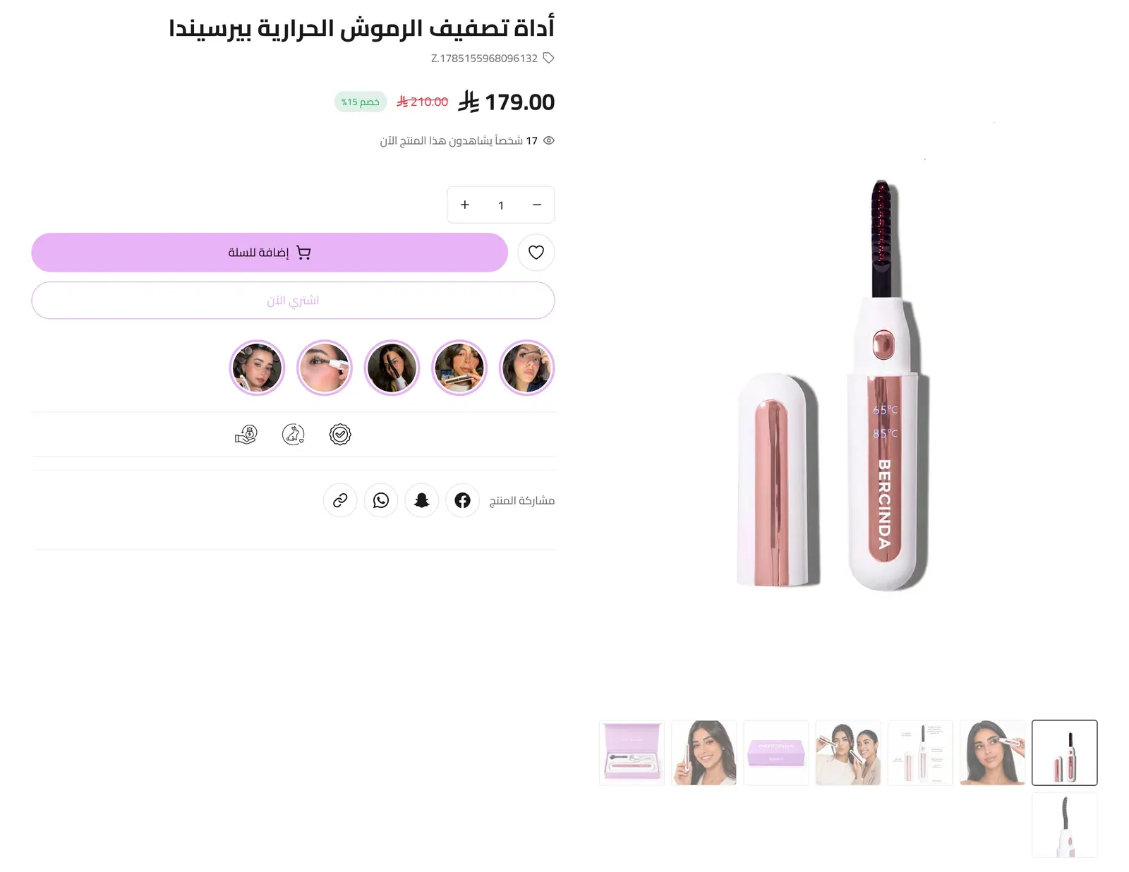
A full product detail block that renders one specific product directly on a page - showing its gallery, price, options, and purchase buttons exactly as if a visitor had opened the product page itself. Separate from the theme’s main product page (which every product uses automatically); this section is for featuring one chosen product anywhere else.
Select Product
Which product this section displays.
Section Style
Which of the theme’s three product-page layouts is used to render this product: Style One, Style Two, or Style Three.
Hide Elements
Each toggle below hides one specific piece of information from the product display, without affecting the product data itself.
- Hide category - hides the product’s category name.
- Hide category image - hides the category’s image.
- Hide product SKU - hides the product’s SKU (its stock code).
- Hide product weight - hides the product’s weight.
- Hide discount percentage - hides the small badge showing the discount percentage next to the price.
- Hide units-sold count - hides how many units of the product have been sold.
- Hide low-stock warning - hides the “Hurry! Only a few left in stock” notice that appears when stock is running low.
- Hide product sharing - hides the whole row of sharing buttons.
- Hide short description - hides the product’s short description.
- Hide Buy Now button - hides the Buy Now button.
- Hide Apple Pay button - hides the Apple Pay button.
- Hide reviews - hides the customer reviews area for the product.
- Hide questions - hides the customer questions area for the product.
Share Buttons
Fine-grained control over the sharing icons, one button at a time. To hide the entire sharing row at once, use “Hide product sharing” above instead.
- Hide Facebook - hides the Facebook share button.
- Hide Snapchat - hides the Snapchat share button.
- Hide WhatsApp - hides the WhatsApp share button.
- Hide Copy Link - hides the button that copies the product’s link.
Live Viewers Counter
- Hide “people viewing now” counter - turns off the counter that shows how many people are currently viewing the product.
- Minimum viewers / Maximum viewers - the range the displayed viewer count fluctuates within.
Product Info Display
- Show weight in the product details - displays the product’s weight next to its SKU, and in the description tab.
- Show the full description instead of the short one - replaces the short description at the top of the page with the full product description.
- Show rating, sales and viewers as a fixed bar - displays those three signals together as one persistent bar.
- Center the product info content - centers the text content instead of the default alignment.
- Make the product name link to the product page - when off, the product name shows as plain, non-clickable text.
- Transparent product page background - removes the background color/pattern behind the product content.
- Product image aspect ratio - the shape of the product images: Default (landscape), Square 1:1, Portrait 3:4, or Tall 2:3.
Price Colors
- Current price color - the color of the product’s active price. Leave empty to use the default text color (which follows light/dark mode automatically).
- Price-before-discount colour - the color of the struck-through original price. Leave empty for the default.
Sticky Elements
- Sticky add-to-cart bar - keeps an add-to-cart bar visible as the visitor scrolls down the page.
- When the sticky bar appears - After scrolling past the section’s buy buttons (the default) shows the bar only once the visitor has scrolled past this section’s add-to-cart buttons, and hides it again when they scroll back up to them. From the top of the page shows the bar as soon as the page opens and keeps it visible the whole time. Only applies when Sticky add-to-cart bar is on.
- Show quantity selector in the sticky bar - includes a quantity picker in that sticky bar.
- Show Buy Now instead of Add to Cart in the sticky bar - when on, the sticky bar shows a Buy Now button in place of the Add to Cart button. Only applies when Sticky add-to-cart bar is on.
- Sticky product gallery - keeps the product images in view while scrolling.
- Sticky bundle selection - keeps a product bundle selector in view while scrolling.
Purchase Options
- Clear the default option selection - forces the customer to actively pick every option (size, color, etc.) before the add-to-cart button becomes clickable, rather than pre-selecting a default.
- Show the price for the chosen quantity - updates the displayed price to reflect the quantity a customer has selected.
- Custom installment bar (Tabby + Tamara) - shows a theme-designed installment payment bar instead of the platform’s default widget.
Trust Badges List
Each entry is one small trust badge (e.g. “Secure Checkout”, “Free Returns”) shown on the product.
- Badge Type - Image Only, or Image & Text.
- Icon - the badge’s icon image.
- Text - the badge’s label, shown when Badge Type is Image & Text.
Custom Texts & Badges
Each entry is one custom line of text or badge added to the product page, with fine control over its look and placement.
- Text - the content itself; emoji are supported.
- Position - where it appears: above the product title, below the product title, or below the short description.
- Display As - shown as plain Text, or as a pill-shaped Badge.
- Badge Style - Outline, Solid, or Soft. Only relevant when Display As is Badge.
- Badge Shape - Pill, Rounded, or Square. Only relevant when Display As is Badge.
- Font Size / Font Weight - the text’s size and boldness.
- Animation - an entrance effect: None, Fade in, Rise in, Pop in, Pulse, Bounce, Wiggle, or Shine.
- Text Color / Background Color (badge) / Border Color (badge) - the colors used for the text and, when shown as a badge, its background and border.
Product Stories
A row of tappable story circles specific to this product, similar to social-media stories, each opening a short full-screen slideshow.
- Show Product Stories - turns the stories row on or off.
- Stories Position On The Product - where the row sits on the page: above the product, under the image gallery, under the description, under the purchase buttons, or below the whole product.
- Heading Above The Stories (optional) - an optional short title shown above the row.
- Circle Size - the diameter of each story circle.
- Space Between Stories - the gap between circles.
- Number Of Stories Visible - how many circles show at once before scrolling.
- Stories Alignment - Start, Center, or End.
- Circle Border Color (empty = store color) - the ring color around each circle; leave empty to use your store’s own color.
Product Stories List
Each entry is one story (one circle). A story contains its own list of slides.
- Enable Story - turns this specific story on or off.
- Story Title - the label shown under the circle.
- Cover Image (optional - the first slide image is used if left empty) - the picture shown on the circle itself.
Story Slides
Each story contains its own list of slides - the sequence shown when that story is opened.
- Enable Slide - turns this specific slide on or off.
- Media Type - Image, an Uploaded Video, or a YouTube Video.
- Image / Video File / YouTube URL - the media shown, matching the Media Type chosen. The YouTube URL accepts full, short (youtu.be), or Shorts links.
- Heading (optional) / Description (optional) - text overlaid on the slide.
- Button Label (optional) / Button URL - an optional button on the slide and where it links.
- Linked Card At The Bottom - whether a small card appears at the bottom of the slide linking to None, a Product, a Category, or an External URL/Page.
- Linked Product / Linked Category / Link - external page, store page, or legal page - the destination, matching the link type chosen above.
- Card Title / Card Image (optional) - the title and picture on that linked card, used for the URL link type.
- Show Price - shows the price on the linked card, when linking to a Product.
- Card Action Text (optional) - a short call-to-action label on the linked card.
- Linked Card Style - Card With Image, or Compact Pill.
- Slide Duration - how long the slide stays on screen (3, 5, or 8 seconds), or Play Full Video to let an uploaded video play through completely before advancing.