

FAQ Section
On this page 12
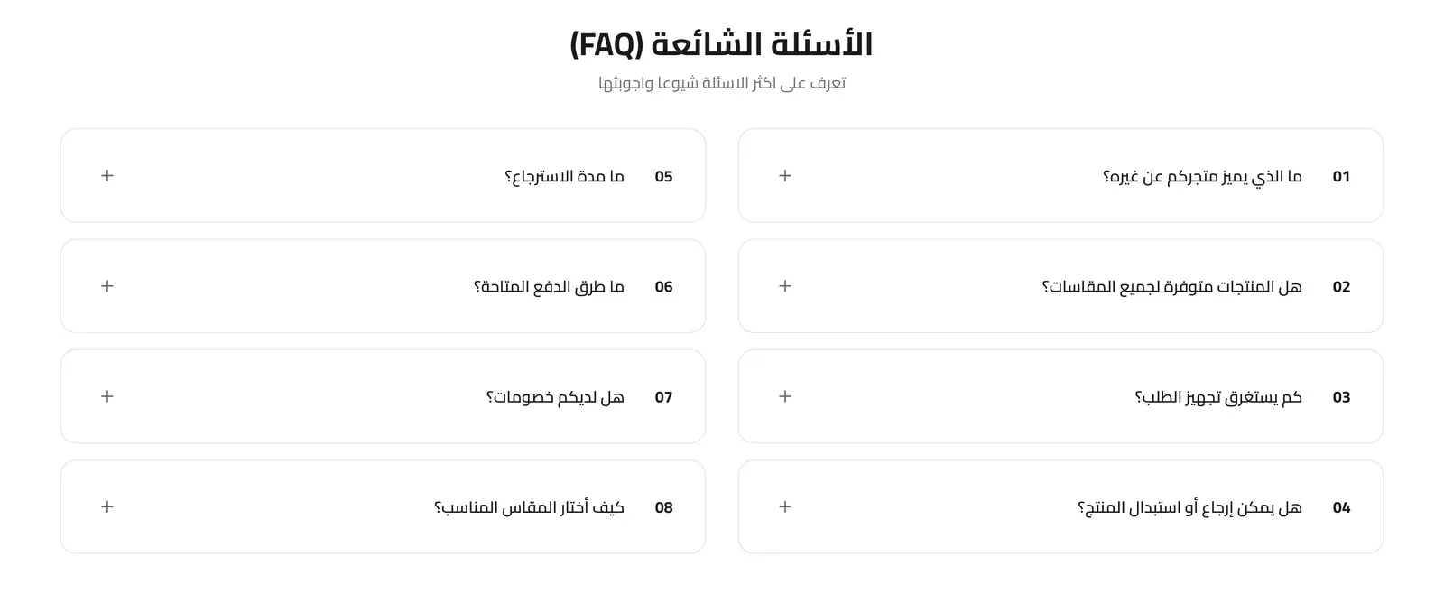
An expandable list of frequently asked questions, either pulled automatically from your store’s FAQ page or written specifically for this section.
Section Header
- Eyebrow (above title) - a short line of text shown just above the section title, handy for a small tagline such as “New Arrivals”. Leave it empty to hide it.
- Eyebrow Style - how the eyebrow looks: Plain text, With Line (a short line before the text), or Pill (the text inside a small rounded badge).
- Eyebrow Font Weight - how bold the eyebrow text appears, from Light to Extrabold.
- Eyebrow Color - the color of the eyebrow text. If left empty, the theme’s accent color is used.
- Badge Background Color - the fill color behind the eyebrow text. Only shows when Eyebrow Style is set to Pill.
- Section Title - the main heading for the section.
- Section Subtitle - supporting text shown near the title.
- Title Font Weight - how bold the title text appears, from Light to Extrabold.
- Subtitle Font Weight - how bold the subtitle text appears, from Light to Extrabold.
- Main Title Color (optional) - a custom color for the section title. Leave it empty to keep the default color.
- Subtitle Color (optional) - a custom color for the subtitle. Leave it empty to keep the default color.
- Header Style - whether the heading sits centered above the questions, or splits to sit side by side.
- Heading Alignment - aligns the heading text to the left, center, or right.
- Title Pre Decoration - a small decorative touch before the title: none, a short bar, an underline, or a spark.
- Subtitle Pre Decoration - a small decorative touch before the subtitle: none, a soft line, or a spark.
FAQ Source
Whether the questions shown come from your store’s existing FAQ page automatically, or from a Custom list of questions you write below.
Layout
Whether questions are shown in One Column, or split across Two Columns.
Style
The visual treatment of each question: Minimal, separated by thin dividers, or Boxed, each inside its own card.
Background
The section’s background: White, Light Gray, or a Custom color you set below.
Custom Background Color
The exact background color, when Background is set to Custom.
Container Width
How wide the question list can grow: Narrow (800px), Medium (1000px), or Wide (1200px).
Accordion Mode (Close others on open)
When on, opening one question automatically closes any other question that was open, so only one answer shows at a time.
Show Question Numbers
When on, displays a number before each question (1, 2, 3…).
Button
- Button Style - the look of any button shown with a question: the theme’s default, a solid Primary or Secondary color, an Outline, a transparent Ghost, White, or a plain Text Link.
- Button Size - how large that button appears.
- Button Font Weight - how bold the button’s label text appears.
- Button Shape - the button’s corner style, from sharp corners to a fully rounded pill shape.
Button Alignment
Where a question’s button aligns: Start (left), Center, or End (right).
FAQ List
Only used when FAQ Source is set to Custom Questions. Each entry is one question/answer pair.
- Question - the question text, shown collapsed by default.
- Answer - the answer text, revealed when the question is expanded.
- Button Text - an optional label for a small button shown with this answer.
- Button Link - the web address that button opens.