

Snapchat Feed
On this page 13
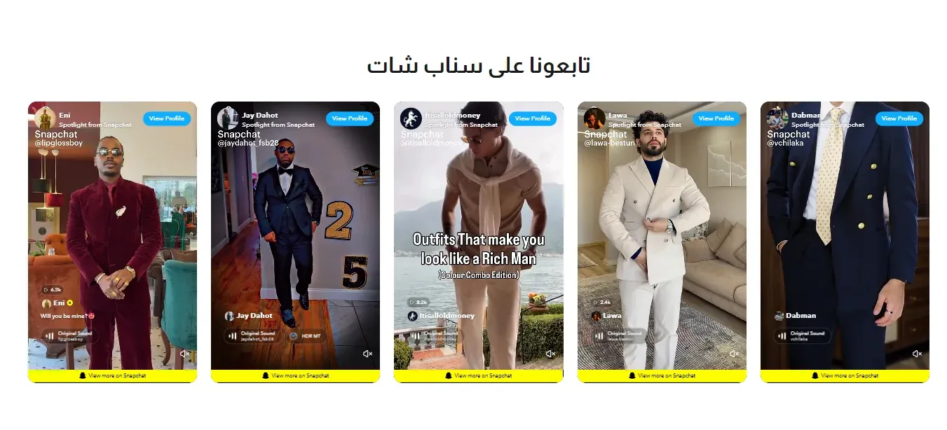
A grid or slider of Snapchat Spotlight videos, letting you showcase your brand’s Snapchat content directly on your storefront.
Section Header
- Eyebrow (above title) - a short line of text shown just above the section title, handy for a small tagline such as “New Arrivals”. Leave it empty to hide it.
- Eyebrow Style - how the eyebrow looks: Plain text, With Line (a short line before the text), or Pill (the text inside a small rounded badge).
- Eyebrow Font Weight - how bold the eyebrow text appears, from Light to Extrabold.
- Eyebrow Color - the color of the eyebrow text. If left empty, the theme’s accent color is used.
- Badge Background Color - the fill color behind the eyebrow text. Only shows when Eyebrow Style is set to Pill.
- Section Title - the main heading for the section.
- Section Description - supporting text shown near the title.
- Title Font Weight - how bold the title text appears, from Light to Extrabold.
- Subtitle Font Weight - how bold the description text appears, from Light to Extrabold.
- Main Title Color (optional) - a custom color for the section title. Leave it empty to keep the default color.
- Subtitle Color (optional) - a custom color for the description text. Leave it empty to keep the default color.
- Header Style - whether the heading sits centered above the videos, or splits to sit side by side.
- Heading Alignment - aligns the heading text to the left, center, or right.
- Title Pre Decoration - a small decorative touch before the title: none, a short bar, an underline, or a spark.
- Subtitle Pre Decoration - a small decorative touch before the description: none, a soft line, or a spark.
Layout
Whether videos are shown in a fixed Grid, or as a Slider (Carousel) visitors can scroll through.
Slider Navigation Style
Only relevant when Layout is Slider. How visitors navigate manually: Arrows, Dots, or a draggable Scrollbar.
Slider Autoplay
Only relevant when Layout is Slider. When on, the slider advances automatically.
Slide Speed (Seconds)
How many seconds between automatic advances. Only used when Slider Autoplay is on.
Autoplay Videos
When on, each video loads and starts playing automatically (muted) as it scrolls into view. When off, a play button is shown instead and the video only loads once clicked, which is lighter on the page.
Card Appearance
How each video’s frame looks: Boxed (with a drop shadow), Bordered (just an outline), or Plain (no frame at all).
Layout & Columns
- Number of Columns (Desktop / Tablet / Mobile) - how many videos sit side by side at each screen size.
- Gap Between Videos - the spacing between each video.
Border Radius
How rounded each video’s corners are.
Maximum Width (0 = full width)
The widest the whole section is allowed to grow, in pixels. Set to 0 for full width.
Show on Mobile
When off, the section is hidden entirely on phone screens.
Section Background Color
The background color behind the whole section.
Spotlight Videos
Each entry in this list is one Snapchat video.
- Snapchat Spotlight URL (required) - the link to the specific Snapchat Spotlight video to embed.
- Caption (optional) - a short caption shown with the video.